Overview
The RCS Business Messaging card has 2 template orientation options:
- Vertical card
- Horizontal card
The vertical card contains the following elements:
- Title text
- Subtitle text
- Image: image in a vertical card is displayed as a horizontal image at the top of the card with aspect ratio of 2:1, 16:9, or 7:3.
- Up to 4 buttons (RCS limitation) with the following actions:
- Link
- Navigation
- Publish text
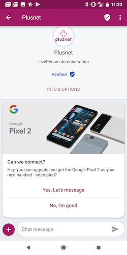
The horizontal card contains the following elements:
- Title text
- Subtitle text
- Image: in a horizontal card a vertical image is displayed at on the left side of the card with aspect ratio of 3:4.
-
Up to 4 buttons (RCS limitation) with the following actions:
- Link
- Navigation
- Publish text
Horizontal card example image:
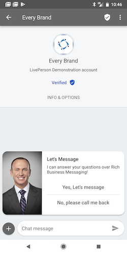
Vertical card example image:
JSON Template Properties
| Property Name | Description | Type | Required |
|---|---|---|---|
| type | Types of basic elements supported by Structured Content framework. If using RCS Cards — type of header element should always be set to "vertical" or “horizontal,” per the wanted user experience. If using RCS Carousels — type of header element will always be “carousel” | Enum | Y |
| tag | Tag of template view, must be “generic” for RCS rich content templates. Within basic element objects, will be “title”/”subtitle”, which will indicate what text should be rendered in each of those elements (the title and subtitle have a default style in RCS) | Enum | Y |
| elements | Array of elements/templates. By using elements in your structured content template, you can send basic elements, such as simple text, images or buttons | Elements/Templates | Y |
| text | The message text in a “text” type element | String | Y |
| tooltip | Element tooltip. Used also for aira | String | N |
| url | Image URL in a “image” type element | String | Y |
| style | Basic structured content elements style object (for RCS this element will be ignored since style configuration is not supported) | Style elements | N |
| bold | Defines if text will be bold or not. Will always be set to ‘true’ in RCS cards and carousels. | Boolean | N |
| size | Defines the element size. Will always be set to ‘large’ in RCS cards and carousels. | Enum — small/medium/large | N |
| button | Buttons contain click and action properties that define the type of action set on user click operation | Object | N |
| click | Click objects contain the action type set on the click operation for each button | Object | N |
| action | Actions are a list of applicative user actions on buttons, which will run on the consumer side and will help them to achieve their operation. Button actions for RCS cards and carousels can be set to Publish text, Link or Navigate | Enum - “publishText”, “link”, “navigate” | N |
Code Examples
Vertical Card
{
  "type": "vertical",
  "tag": "generic",
  "elements": [
    {
      "type": "vertical",
      "elements": [
        {
          "type": "image",
          "url": "https://i.pinimg.com/736x/a0/67/5e/a0675e5161d7ae5be2550987f397a641--flower-shops-paper-flowers.jpg",
          "tooltip": "Flowers"
        },
        {
          "type": "text",
          "tag": "title",
          "text": "Birthday Bouquet",
          "tooltip": "Title"
        },
        {
          "type": "text",
          "tag": "subtitle",
          "text": "Wild flowers",
          "tooltip": "subtitle"
        },
        {
          "type": "button",
          "tooltip": "Publish text example",
          "title": "Publish text example",
          "click": {
            "actions": [
              {
                "type": "publishText",
                "text": "Published text button tap"
              }
            ]
          }
        },
        {
          "type": "button",
          "tooltip": "URL button example",
          "title": "URL button example",
          "click": {
            "actions": [
              {
                "type": "link",
                "name": "URL button tap",
                "uri": "https://www.pinterest.com/lyndawhite/beautiful-flowers/"
              }
            ]
          }
        },
        {
          "type": "button",
          "title": "Navigate",
          "click": {
               "actions": [
              {
                "type": "navigate",
                "lo": 40.7562,
                "la": -73.99861
              }
            ]
          }
        }
      ]
    }]}
Horizontal Card
{
  "type": "horizontal",
  "tag": "generic",
  "elements": [
    {
      "type": "vertical",
      "elements": [
        {
          "type": "image",
          "url": "https://i.pinimg.com/736x/a0/67/5e/a0675e5161d7ae5be2550987f397a641--flower-shops-paper-flowers.jpg",
          "tooltip": "Flowers"
        },
        {
          "type": "text",
          "tag": "title",
          "text": "Birthday Bouquet",
          "tooltip": "Title"
        },
        {
          "type": "text",
          "tag": "subtitle",
          "text": "Wild flowers",
          "tooltip": "subtitle"
        },
        {
          "type": "button",
          "tooltip": "Publish text example",
          "title": "Publish text example",
          "click": {
            "actions": [
              {
                "type": "publishText",
                "text": "Published text button tap"
              }
            ]
          }
        },
        {
          "type": "button",
          "tooltip": "URL button example",
          "title": "URL button example",
          "click": {
            "actions": [
              {
                "type": "link",
                "name": "URL button tap",
                "uri": "https://www.pinterest.com/lyndawhite/beautiful-flowers/"
              }
            ]
          }
        },
        {
          "type": "button",
          "title": "Navigate",
          "click": {
               "actions": [
              {
                "type": "navigate",
                "lo": 40.7562,
                "la": -73.99861
              }
            ]
          }
        }
      ]
    }]}