
The goal of the following document is to enumerate the different fields controlling design attributes in the SDK. If a clearer view of which attribute corresponds with a design element is needed, refer to the Attributes Design Sheet.
For things like Brand name, which is a string, refer to string values.
DarkTheme support
With the addition of Dark Theme support in Android 10, we now created LP Semantic color attributes to update colors based on the selection provided by the OS. We believe this is the easiest implementation for customers who use our default configurations as well as those customers who desire custom attribute configurations. We support only System-wide setting for black theme.
What does this mean for customers who use our default Attribute configurations?
If you are currently using our default attribute configurations, do a quick check below to see if the default value has changed. It is likely that existing colors have been updated and new color attribute configurations are added. You must support Dark Theme for Android 10 and you can use default color configurations or you can customize them, as we have handled the support for you by updating the SDK color theme where possible. This appearance is different than the previous implementation but is intended to be more in line with what Android users expect. We have worked hard on its implementation and hope you enjoy it.
What does this mean for customers who use custom attribute configurations?
If you have customized the appearance of the Android SDK by setting your own values for lp color attributes, note that unless you have custom colors set for lp color attribute values in values-night folder your custom configuration will not support dark mode and the UI may not appear as expected.
What does this mean for consumers on Android 9 and below?
we have mirrored the implementation for our Light theme for Android devices operating on android 9 and below using non-semantic colors that closely resemble the light android system colors.
How to implement custom color configurations within the LPMessaging Android SDK that support Dark Theme?
For all your custom color and style configurations, you are able to use specific resource folders like values-night and drawable-night in your application to override LP Android SDK Attributes. In this way, you can perfectly fit the design to your company's color theme and your users wishes.
| LP Semantic Color Name | Light Theme color | Dark Theme color |
|---|---|---|
| lp_colorPrimary | #f5f5f5 | #272727 |
| lp_colorPrimaryDark | #000000 | #000000 |
| lp_colorOnPrimary | #000000 | #FFFFFF |
| lp_textColorSecondary | #000000 | #FFFFFF |
| lp_colorBackground | #000000 | #121212 |
| lp_colorOnBackground0 | #2e2e2e | #949596 |
| lp_colorOnBackground1 | #46474a | #787878 |
| lp_colorOnBackground2 | #5b5c5e | #5b5c5e |
| lp_colorSurface | #f5f5f5 | #272727 |
| lp_colorOnSurface | #000000 | #FFFFFF |
| lp_agent_message_bubble_color | #D6D6D6 | #3B3B3B |
| lp_onAgentMessage_bubble_color | #000000 | #DEDEDE |
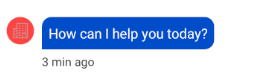
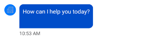
| lp_consumer_message_bubble_color | #004dc9 | #448AFF |
| lp_onConsumerMessage_bubble_color | #FFFFFF | #DEDEDE |
| lp_colorSecondary | #f5f5f5 | #272727 |
| lp_colorOnSecondary | #000000 | #FFFFFF |
| lp_colorError | #de0a23 | #CF6679 |
| lp_colorCorrectly | 229a49 | #30d158 |
| lp_consumer_action_highLight_color | #004dc9 | #448AFF |
| lp_linkPreviewColor | #f5f5f5 | #272727 |
| lp_progress_bar_color | #018786 | #03DAC6 |
| lp_brand_color | #EF6C00 | #FF6F00 |
| lp_unread_messages_count_highLight_color | #EB3B2F | #F5786F |
| lp_feedback_option_selectedColor | #229a49 | #30d158 |
| lp_disabledColor | #b7b8b9 | #46474a |
| lp_rippleEffect_SC | #3c9dae | #3c9dae |
| lib_dp_calendar_bg_color | #FFFFFF | #000000 |
| lib_dp_close_button_fill_color | #0363AD | #BA86FC |
| lib_dp_close_button_stroke_color | #1A0364AD | #1FBA86FC |
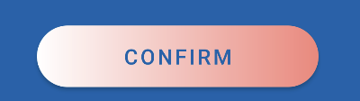
| lib_dp_confirmation_arrow_color | #FFFFFF | #FFFFFF |
| lib_dp_confirmation_bg_color | #0363AD | #2E2E2E |
| lib_dp_confirmation_button_bg_color | #FFFFFF | #FFFFFF |
| lib_dp_confirmation_button_text_color | #0363AD | #BA86FC |
| lib_dp_confirmation_info_text_color | #FFFFFF | #FFFFFF |
| lib_dp_default_date_color | #3b4144 | #FFFFFF |
| lib_dp_disable_date_color | #BDBDBD | #99FFFFFF |
| lib_dp_divider_color | #1A0364AD | #1FBA86FC |
| lib_dp_dropdown_arrow_color | #0363AD | #BA86FC |
| lib_dp_dropdown_item_bg_color | #FFFFFF | #2E2E2E |
| lib_dp_header_bg_color | #FFFFFF | #2E2E2E |
| lib_dp_month_year_text_color | #4F4F4F | #FFFFFF |
| lib_dp_range_bg_color | #1A0364AD | #FFFFFF |
| lib_dp_range_date_color | #3b4144 | #000000 |
| lib_dp_selected_date_circle_color | #0363AD | #BA86FC |
| lib_dp_selected_date_color | #FFFFFF | #000000 |
| lib_dp_weekday_title_color | #000 | #FFFFFF |
Accessibility
snackbar_duration_for_accessibility
Number of milliseconds to show the TTR snackbar if the accessibility TalkBack option is on.
- Type: integer
- Default value: 60000
Note: This value was previously named snachbar_duration_for_accessibility, and its spelling has since been corrected.
announce_agent_typing
Announce when the agent is typing.
- Type: bool
- Default value: true
Note: This flag was previously applied only for Activity mode. Now it is working in both Activity and Fragment mode.
lp_announce_events_with_live_region
Enable or disable announcement of SDK events using live region in Polite mode.
- Type: bool
- Default value: true
- Available since: 5.20.2
lp_announce_new_message_content
Enable or disable the announcement of content of newly received message. This controls whether AccessibilityService announces new message content when it is received or it should be replaced with unread messages count.
If true: Talkback now consistently announces "New agent message"/"New system message"/"New message" + message content.
Otherwise: Talkback will announce "New agent message"/"New system message"/"New message" + number of unread messages
- Type: bool
- Default value: true
- Available since: 5.24.1
Note: If TalkBack version is 14.0, TalkBack will announce SDK events sequentially without using live region.
lp_announce_message_status_first
Enable this configuration (true) to announce the message's status before timestamp.
- Type: bool
- Default value: false
- Available since: 5.23.0
Agent Assignment
send_agent_profile_updates_when_conversation_closed
When set to true the callback LivePersonCallback onAgentDetailsChanged calls with the agent detail updates even if the last conversation is closed. In this case, it provides the assigned agent of the last conversation. If false, this callback is only called when the current conversation is active.
- Type: bool
- Default value: true
Audio messaging
enable_voice_sharing
Enable or disable the audio messaging feature.
- Type: bool
- Default value: false
lp_record_max_time_seconds
Maximum voice recording time in seconds.
- Type: int
- Default value: 120
max_number_stored_voice_files
Maximum number of voice files stored on the device.
- Type: int
- Default value: 20
Avatars
avatar_margin_leading
Defines the remote avatar leading spacing (from the left edge to the avatar).
- Type: dimen
- Default value: @dimen/margin_regular
avatar_margin_trailing
Defines the remote avatar Trailing spacing (from the avatar to the bubble).
- Type: dimen
- Default value: @dimen/margin_regular
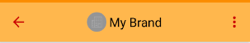
Brand
lp_brand_header_text_color
The configuration to change the Brand name / Agent name text color in the header.
- Type: color
- Default value: @color/lp_colorOnPrimary

brand_bubble_stroke_width
Int number for the outline width.
- Type: dimen
- Default value: 0dp
brand_bubble_stroke_color
Color code for the outline color.
- Type: color
- Default value: @color/lp_brand_color
brand_bubble_message_text_color
Color code for the text of the brand bubble.
- Type: color
- Default value: @color/lp_onAgentMessage_bubble_color
brand_bubble_message_link_text_color
Color code for links in the text of the brand bubble.
- Type: color
- Default value: @color/lp_consumer_action_highLight_color
brand_bubble_timestamp_text_color
Color code for the timestamp of the brand bubble.
- Type: color
- Default value: @color/lp_colorOnBackground1
brand_bubble_background_color
Color code for the background of the brand bubble.
- Type: color
- Default value: @color/lp_brand_color
brand_logo_background_color
Color code for the background of the default brand logo next to the bubble.
- Type: color
- Default value: @color/lp_brand_color
brand_bubble_padding_right
Brand's welcome message bubble right padding.
- Type: dimen
- Default value: 8dp

brand_bubble_padding_left
Brand's welcome message bubble left padding.
- Type: dimen
- Default value: 8dp

brand_bubble_padding_top
Brand's welcome message bubble top padding.
- Type: dimen
- Default value: 8dp

brand_bubble_padding_bottom
Brand's welcome message bubble bottom padding.
- Type: dimen
- Default value: 8dp
custom_font_name_conversation_feed
The font name for all conversation feed’s element.
- Type: string
- Default value: Empty (use the device font)
- Example: sans-serif-thin
custom_font_name_non_conversation_feed
The font name for all elements that are not in the conversation feed.
- Type: string
- Default value: Empty (use the device font)
- Example: customFont.ttf
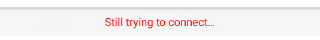
Connection status bar
connection_status_connecting_bg_color
Define the color of status bar background color while trying to connect.
- Type: color
- (Light Theme) Default value: #F2F5F5F5
- (Dark Theme) Default value: #46474A

connection_status_not_connected_bg_color
Define the color of status bar background color when connection is unavailable.
- Type: color
- (Light Theme) Default value: #CC000000
- (Dark Theme) Default value: #CC000000

connection_status_connecting_text_color
Define the color of status bar text color while trying to connect.
- Type: color
- (Light Theme) Default value: #46474A
- (Dark Theme) Default value: #F2F5F5F5
connection_status_not_connected_text_color
Define the color of status bar text color when connection is unavailable.
- Type: color
- (Light Theme) Default value: #FFFFFF
- (Dark Theme) Default value: #FFFFFF

lp_is_connection_bar_enabled
Enable this configuration (true) to show connection status when the user navigates to conversation screen and SDK tries to connect.
- Type: bool
- Default value: true
- Available since: 5.23.0
Controller Message
conversation_controller_message_text_color
Color code for the text of the automatic messages.
- Type: color
- Default value: @color/lp_colorOnBackground1

controller_message_markdown_hyperlink_text_color
Color code for the markdown hyperlink in the automatic messages.
- Type: color
- Default value: @color/lp_colorOnBackground1
Conversation Activity Style (activity mode only!)
lp_colorPrimary
Define the primary color of the activity.
- Type: color
- Default value: android:colorPrimary
lp_colorPrimaryDark
Define the primary dark color of the activity.
- Type: color
- Default value: android:colorPrimaryDark
lp_textColorSecondary
Define the color of menu button and back arrow on toolbar.
- Type: color
- Default value: black
conversation_toolbar_color
Define the toolbar color of conversation screen.
- Type: color
- Default value: @color/lp_colorPrimary
conversation_toolbar_isTyping_color
Define the color of agent typing indicator on conversation toolbar.
- Type: color
- Default value: #9B9B9B
feedback_toolbar_background
Define the toolbar color of feedback screen.
- Type: color
- Default value: @color/lp_colorPrimary
feedback_toolbar_textColor
Define the text color on feedback toolbar.
- Type: color
- Default value: @color/lp_colorOnPrimary
captionPreview_toolbar_textColor
Define the text color on caption preview toolbar.
- Type: color
- Default value: @color/lp_colorOnPrimary
captionPreview_toolbar_background
Define the tool bar color of caption preview screen.
- Type: color
- Default value: @color/lp_colorPrimary
pci_form_toolbar_background
Define the toolbar color of PCI form screen.
- Type: color
- Default value: @color/lp_colorPrimary
pci_form_toolbar_textColor
Define the text color on PCI form toolbar.
- Type: color
- Default value: @color/lp_colorOnPrimary
lp_menu_item_background
Define the background color of toolbar menu.
- Type: color
- Default value: @color/lp_colorPrimary
lp_menu_item_enabled_textColor
Define the menu item color when enabled.
- Type: color
- Default value: @color/lp_colorOnPrimary
lp_menu_item_disabled_textColor
Define the menu item color when disabled.
- Type: color
- Default value: @color/lp_disabledColor
lp_resolve_conversation_menu_item_visible
Define the visibility of "Mark as resolved" menu item.
- Type: bool
- Default value: true
lp_show_agent_avatar
Define the visibility of connected agent/bot avatar.
- Type: bool
- Default value: true
lp_show_brand_avatar
Define the visibility of brand's avatar when no ongoing conversation exists for consumer.
- Type: bool
- Default value: true
lp_urgency_menu_item_visible
Define the visibility of "Mark as urgent" menu item.
- Type: bool
- Default value: true
clear_history_menu_item_visible
Define the visibility of "Clear history" menu item.
- Type: bool
- Default value: true
lp_conversation_is_light_status_bar
Flag to show light/dark status bar for conversation screen in activity mode.
- Type: bool
- Value for dark mode: false
- Value for light mode: true
lp_conversation_is_light_navigation_bar
Flag to show light/dark navigation bar for conversation screen in activity mode.
- Type: bool
- Value for dark mode: false
- Value for light mode: true
Conversations
conversation_background (color)
Define the color code for the entire view background.
In activity mode — also the color of android:windowBackground.
- Type: color
- Default value: @color/lp_colorBackground
conversation_background (image)
Sets the conversation background image.
If using Fragment mode, the minimum SDK version supports this configuration is v5.5.0.
Type: drawable
lp_caption_preview_fragment_background_color
Define the background color of caption preview screen when sending a file.
- Type: color
- Default value: #ffffff
- Default value(Dark theme): #000000
bubble_system_resolved_text_size
Conversation resolved message text size.
- Type: dimen
- Default value: 12sp
bubble_system_resolved_padding
Conversation resolved message padding.
- Type: dimen
- Default value: 4sp
bubble_system_resolved_line_spacing
Conversation resolved message line spacing.
- Type: dimen
- Default value: 0dp
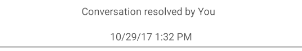
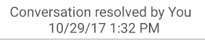
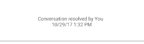
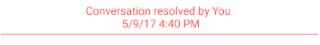
enable_conversation_resolved_message
Enable or disable the conversation resolved message.
- Type: bool
- Default value: true
enable_conversation_resolved_separator
Enable or disable separators between conversations.
- Type: bool
- Default value: true

lp_enable_conversation_resolved_separator_on_auto_close
Enable or disable separators for auto closed conversations.
- Type: bool
- Default value: false
conversation_separator_text_color
Color code for the conversation resolved message and separator.
- Type: color
- Default value: @color/lp_colorOnBackground1
lp_hide_ui_until_auth
Define if SDK shows conversation until pass authentication check.
- Type: bool
- Default value: true
lp_hide_welcome_message_on_clear_history
Define to hide welcome message on clearing a history.
- Type: bool
- Default value: false
empty_history_view_text_color
Define the text color of empty history view.
- Type: color
- Default value: @color/lp_colorOnBackground1
Data Masking
enable_client_only_masking
Defines whether to enable or disable client side only masking. False by default. This configuration is only applied for UnAuth consumer.
- Type: bool
- Default value: false
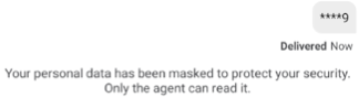
enable_real_time_masking
Defines whether to enable or disable real time masking.
- Type: bool
- Default value: false
client_only_masking_regex
Defines the java regex for client side only masking. By default does not contain any value.
- Type: string
- Default value: No value
client_only_mask_character
The character used to mask client only string.
- Type: string
- Default value: '*'
real_time_masking_regex
Defines the Java regex for real time masking.
- Type: string
- Default value: No value
real_time_mask_character
The character used to mask the real time message.
- Type: string
- Default value: '*'
Dark Mode configurations
darkMode_force_enable_for_webView
If true, force dark mode is applied to webView when system dark mode is enabled.
- Type: bool
- Default value: true
darkMode_SC_QR_override_colors_from_LE
If false, colors for structured content elements and quick replies are overridden from LE in dark theme.
- Type: bool
- Default value: false
Date and Time
lp_date_format
Define date format.
- Type: string
- Default value: No value
lp_time_format
Define time format.
- Type: string
- Default value: No value
lp_date_time_format
Define date-time format.
- Type: string
- Default value: No value
message_status_numeric_timestamp_only
When false (default), timestamps display information relative to when sent/distributed/read, for example, "5 minutes ago". When true, shows as numeric only, for example, "11:32".
- Type: bool
- Default value: false
sendingMessageTimeoutInMinutes
Define timeout for automatic resending pending message before moving it to failed.
- Type: integer
- Default value: 60
Date Separator
lp_header_text_color
Text color for the Day/date header.
- Type: color
- Default value: @color/lp_colorOnSurface
lp_header_background_color
Background color for the Day/date header.
- Type: color
- Default value: @color/lp_colorSurface

sticky_timestamp_text_size
Font text size for the Date Separator.
- Type: dimen
- Default value: @dimen/small_text_size

sticky_timestamp_margin_top
Top margin spacing of the Date Separator.
- Type: dimen
- Default value: 8dp
enter_message_top_separator_color
Top border color for the Input TextView.
- Type: color
- Default value: @android:color/darker_gray

bubble_system_resolved_text_size
Defines the Resolved system message text size.
- Type: dimen
- Default value: small_text_size
bubble_system_resolved_padding
Defines the Resolved system message padding.
- Type: dimen
- Default value: margin_half
bubble_system_resolved_line_spacing
Defines the Resolved system message line spacing.
- Type: dimen
- Default value: 0dp
bubble_system_resolved_separator_padding_bottom
Defines the Resolved system message Separator padding.
- Type: dimen
- Default value: margin_half

lp_progress_bar_image
Defines the Progress bar image. If empty, the default Progress bar appears.
- Type: drawable
- Default value: @drawable/lp_load_more_progress_bar_image
lp_progress_bar_image_color
Defines the color of default progress bar image.
- Type: color
- Default value: @color/lp_progress_bar_color
lpmessaging_ui_image_progress_bar.xml
Default progress bar vector drawable for downloading or uploading an image. It appears on the image, inside the bubble, until progress is done. To override this resource, create a vector drawable under the android drawable folder with the same resource name.
Delivery Notifications
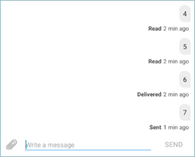
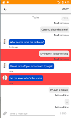
message_receive_icons
For each message, there are three indicators available: Message sent, Message received, and Message read.
You can customize the indicators according to your needs, by using a number between 1 and 3.
Type: integer
- 0: text (sent, delivered etc.) instead of icons
- 1: Sent only
- 2: Sent+received
- 3: Sent+received+read
message_receive_text
If you set the resource message_receive_icons to 0, you can specify what texts appear for each state.
Type: string-array
- 1st item: message sent
- 2nd item: message delivered
- 3rd item: message read
- 4th item: message not delivered
- 5th item: message sending
clear_history_show_confirm_dialog
Define if to show confirm dialog before clearing history or not.
- Type: bool
- Default value: true
General Style
is_enable_enlarge_emojis
When true, user and remote user messages containing one or two emojis will be enlarged in chat. Messages with one emoji will be the largest, two emojis will be large, and three or more will be displayed as normal text.
- Type: bool
- Default value: false
vibrate_enabled
Enable or disable vibrate upon receiving messages from agent while conversation screen is in foreground. false by default.
- Type: bool
- Default value: false
contextual_menu_on_toolbar
Enable multiple message copy menu over the app toolbar. If true, when long pressing a message on chat it will select the message and enable a context menu over the toolbar, enabling the user to copy multiple messages. If false, long pressing a message will display a copy popup menu.
- Type: bool
- Default value: true
bubble_selected_background_color
Define the background color of item when it’s selected to be copied (if multiple message copy is enabled).
- Type: color
- Default value: #5597a7e3
encryptionVersion
Defines the encryption version to use. Currently available version 1 only.
- Type: integer
- Default value: 1 (encrypted)
csds_url
For vanity URL purposes.
- Type: string
- Default value: adminlogin.liveperson.net
lp_bubble_phone_links_regex
Defines the java regex for phone links in bubble messages.
- Type: string
- Default value: No value
lp_bubble_url_links_regex
Defines the java regex for url links in bubble messages.
- Type: string
- Default value: No value
lp_bubble_email_links_regex
Defines the java regex for email links in bubble messages. By default does not contain any value.
- Type: string
- Default value: No value
lp_welcome_message_delay_in_seconds
Timeout duration in seconds which SDK will wait for a welcome message from brand's app.
- Type: integer
- Default value: 0
lpinfra_ui_ic_send_disabled.xml
You can display a different drawable to represent sending a message. Create a drawable file named lpinfra_ui_ic_send_disabled.xml, which overrides the SDK's default drawable.
To display an image instead of text, set the use_send_image_button boolean to true.
- Type: color
- Default value: #555555 (gray)

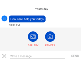
lpmessaging_ui_ic_gallery.xml
You can replace the existing Gallery image button. Create a drawable file named lpmessaging_ui_ic_gallery.xml, which overrides the SDK's default drawable.
- Type: color
- Default value: #004DC9 (blue)

lpmessaging_ui_ic_camera.xml
You can replace the existing Library image button. Create a drawable file named lpmessaging_ui_ic_camera.xml, which overrides the SDK's default drawable.
- Type: color
- Default value: #004DC9 (blue)

lpinfra_ui_ic_attach.xml
You can replace the existing Attach image. Create a drawable file named lpinfra_ui_ic_attach.xml, which overrides the SDK's default drawable.
- Type: color
- Default value: #555555 (gray)

lpinfra_ui_ic_close.xml
You can replace the existing Close image. Create a drawable file named lpinfra_ui_ic_close.xml, which overrides the SDK's default drawable.
- Type: color
- Default value: #555555 (gray)

Link navigation
lp_message_link_as_callback
Define whether links within agent/bot/brand/controller messages should be intercepted by the brand's app via callback.
- Type: bool
- Default value: false
Link Preview
link_preview_enable_feature
Enable or disable link preview feature
- Type: bool
- Default value: true
link_preview_use_big_picture
Define which configuration to show when sending / receiving s link (big / small picture).
- Type: bool
- Default value: true
link_preview_enable_real_time_preview
Define whether or not we should show a real time link preview. A preview while the consumer is typing an url.
- Type: bool
- Default value: true
link_preview_to_use_more_than_og_tags
parse only <og:> tags or others as well
- Type: bool
-
Default value: true
- false: use <og:title> tags only
- true: use <og:title> and <title> tags
Message Edit Text
enter_message_background_color
Background color of enter message view.
- Type: color
- Default value: @color/lp_colorSurface
lp_enter_msg_text
Define the input message text color.
- Type: color
- Default value: @color/lp_textColorSecondary

lp_enter_msg_hint
Define the input message hint color.
- Type: color
- Default value: @android:color/darker_gray

lp_send_button_text_enable
Define the color of the send button when it’s enabled.
- Type: color
- Default value: @color/lp_consumer_action_highLight_color


lp_send_button_text_disable
Define the color of the send button when it’s disabled.
- Type: color
- Default value: @color/lp_disabledColor


use_send_image_button
Use an icon for the send button instead of "Send" text.
- Type: bool
- Default value: false

enable_ime_options_action_send
Enable or disable the action button of the keyboard. If enabled, pressing the action button will send a message. Multi line messages are not supported if enabled.
- Type: bool
- Default value: false
lp_voice_record_button_color
Defines the color of record button on enter message view.
- Type: color
- Default value: @android:color/darker_gray
lp_voice_stop_button_color
Defines the color of stop recording button on enter message view.
- Type: color
- Default value: @android:color/darker_gray
lp_voice_replay_button_color
Defines the color of replay button on enter message view.
- Type: color
- Default value: @android:color/darker_gray
lp_voice_trash_button_color
Defines the color of trash button on enter message view.
- Type: color
- Default value: @android:color/darker_gray
enter_message_url_preview_bubble
Defines the background color url preview on top of enter message view.
- Type: color
- Default value: @color/lp_linkPreviewColor
enter_message_url_preview_bubble_stroke_color
Defines the stroke color of url preview on top of enter message view.
- Type: color
- Default value: @color/lp_linkPreviewColor
enter_msg_url_preview_close_icon_color
Defines the color of close url preview icon color.
- Type: color
- Default value: @color/lp_textColorSecondary
enter_msg_url_preview_title
Defines the color of url preview title.
- Type: color
- Default value: @color/lp_colorOnSurface
enter_msg_url_preview_description
Defines the color of url preview description.
- Type: color
- Default value: @color/lp_colorOnSurface
lp_file_attach_icon_clip_color
Defines the color of attach icon on enter message view.
- Type: color
- (Light Theme)Default value: #FF767678
- (Dark Theme)Default value: @android:color/darker_gray
lp_file_close_icon_clip_color
Defines the color of close icon on enter message view.
- Type: color
- (Light Theme)Default value: #FF767678
- (Dark Theme)Default value: @android:color/darker_gray
Navigation — Scroll Behavior Configuration
lp_scroll_show_conversation
Configures the scroll behavior when open conversation screen from another screen of the app.
- Type: string
- Default value: Bottom
Available options:
- Bottom
- LastPosition
- FirstUnreadMessage
lp_scroll_when_foreground
Configures the scroll behavior when bring conversation screen to foreground from background.
- Type: string
- Default value: LastPosition
Available options:
- Bottom
- LastPosition
- FirstUnreadMessage
lp_scroll_when_push_notification
Configures the scroll behavior when open conversation screen by tapping on push notification.
- Type: string
- Default value: Bottom
Available options:
- Bottom
- LastPosition
- FirstUnreadMessage
lp_scroll_when_scroll_down
Configures the scroll behavior when tapping on the scroll down indicator.
- Type: string
- Default value: Bottom
Available options:
- Bottom
- LastPosition
Navigation — Scroll down indicator
scroll_down_indicator_enabled
Enable or disable the scroll down indicator (shown or invisible).
- Type: bool
- Default value: true
scroll_down_indicator_unread_summary_enabled
Enable or disable the summary in scroll down indicator (shown or invisible). If unread_indicator_bubble_enable is false, it's in minimized mode without a badge indicating number of unread message. Tapping scrolls to the last message.
The scroll to bottom button width is dynamic and will be auto adjusted based on length of the summary text.
- Type: bool
- Default value: true
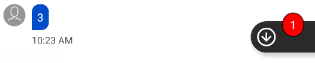
scroll_down_indicator_unread_counter_text_color
Color of the unread messages counter text color.
- Type: color
- Default value: @color/lp_colorOnSecondarye
scroll_down_indicator_unread_summary_text_color
Color of the unread message summary (preview) text color.
- Type: color
- Default value:@color/lp_colorOnSecondary
scroll_down_indicator_unread_counter_stroke_color
Color of the unread messages counter stroke color.
- Type: color
- Default value: @color/lp_unread_messages_count_highLight_color
scroll_down_indicator_unread_counter_stroke_width
Dimension of the unread messages counter stroke width.
- Type: dimen
- Default value: 1dp
scroll_down_indicator_unread_counter_solid_color
Color of the unread messages counter solid color.
- Type: color
- Default value: @color/lp_unread_messages_count_highLight_color
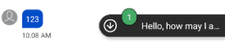
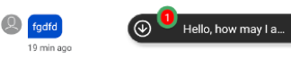
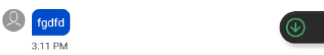
scroll_down_indicator_background_color
Color of the scroll down background color.
- Type: color
- Default value: @color/lp_colorSecondary
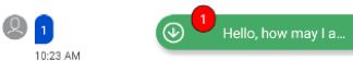
scroll_down_indicator_arrow_down_color
Color of the image arrow scrolling down.
- Type: color
- Default value: @color/lp_colorOnSecondary
scroll_down_indicator_radius
Left top and left bottom corner radius of the scroll down indicator.
- Type: dimen
- Default value: 20dp for left top and the left bottom the corners
scroll_down_indicator_counter_radius
Corner radius of the unread messages counter inside the scroll down indicator.
- Type: dimen
- Default value: 20dp for all the corners
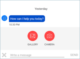
Photo and file sharing
enable_photo_sharing
Enable or disable the photo sharing feature.
- Type: bool
- Default value: false
max_number_stored_images
Define the max number of images that will be stored locally.
- Type: integer
- Default value: 20
max_number_stored_documents
Define the max number of documents that will be stored locally.
- Type: integer
- Default value: 20
full_image_compression_rate
Define the image compression rate (percentage).
- Type: integer
- Default value: 50
full_image_longer_dimension_resize
Define the size of the full image longer dimension after resizing it (pixels).
- Type: integer
- Default value: 800
max_image_size_kb
Define the maximum image size in KB that can be uploaded.
- Type: integer
- Default value: 3000
attachment_menu_item_background_color
Define the background color of the items in the attachment menu.
- Type: color
- Default value: @color/lp_consumer_action_highLight_color
lp_attachment_menu_background_color
Define the background color of the attachment menu.
- Type: color
- Default value: #F5F5F5 (light gray)
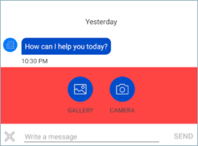
lp_attachment_menu_item_text_color
Define the items’ text color in the attachment menu.
- Type: color
- (Light Theme)Default value: #46474A (gray)
- (Dark Theme)Default value: #f5f5f5 (light gray)
lp_attachment_menu_item_icon_color
Define the items’ icon color in the attachment menu.
- Type: color
- (Light Theme)Default value: #ededed (light gray)
- (Dark Theme)Default value: #ededed (light gray)
lp_attachment_menu_background_color
Define the color of attachment menu background
- Type: color
- Default value: @color/lp_colorSurface
Quick replies
lpui_quick_reply_button_vertical_padding
Quick Replies button padding above and below the button text.
- Type: dimen
- Default value: 12dp
lpui_quick_reply_button_horizontal_padding
Quick Replies button padding on right and left of button text.
- Type: dimen
- Default value: 12dp
lpui_quick_reply_button_vertical_margin
Quick Replies button margin below.
- Type: dimen
- Default value: 12dp
lpui_quick_reply_button_horizontal_margin
Quick Replies button margin to the right.
- Type: dimen
- Default value: 8dp
lpui_quick_reply_button_border_width
Quick Replies button border width.
- Type: dimen
- Default value: 1dp
quick_reply_button_radius
Quick Replies button radius.
- Type: dimen
- Default value: 24dp
lp_quick_replies_button_text_limit
Quick Replies button text limit.
- Type: integer
- Default value: 25
quick_reply_button_text_color
Quick Replies button text color.
- Type: color
- Default value: @color/lp_consumer_action_highLight_color
quick_reply_button_background_color
Quick Replies button background color.
- Type: color
- Default value: @color/lp_colorSurface
quick_reply_button_stroke_color
Quick Replies button stroke color.
- Type: color
- Default value: @color/lp_agent_message_bubble_color
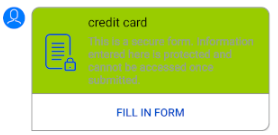
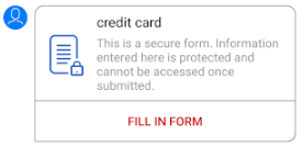
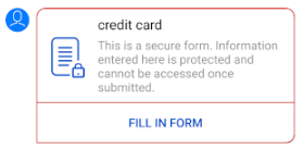
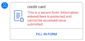
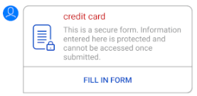
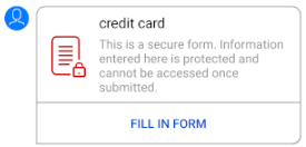
Secure Form
pci_form_hide_logo
Define if to hide logo inside the pci secure form web view.
- Type: bool
- Default value: false
pci_form_font_name
Secure form custom font name to be used while user is filling out the secure form. If not set, the default font will be used. This is passed as CSS as secure forms are opened in a webview and will need to conform to web standards.
- Type: string
- Default value: No value (use device's default)
lpmessaging_ui_secure_form_progress_bar.xml
Default progress bar vector drawable for PCI secure form (after pressing to fill the form, the button changes to progress bar until we can show the form). To override this resource, create a vector drawable under the android drawable folder with the same resource name.
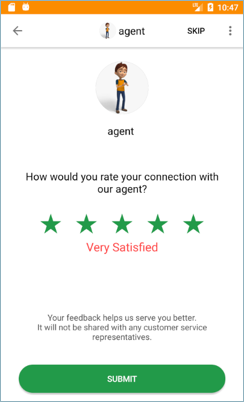
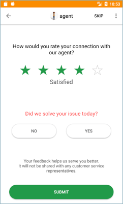
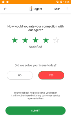
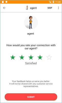
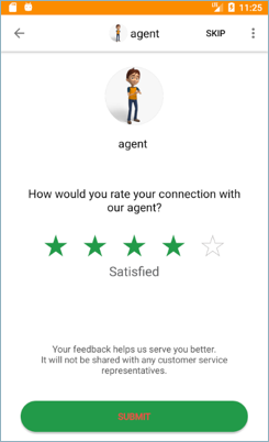
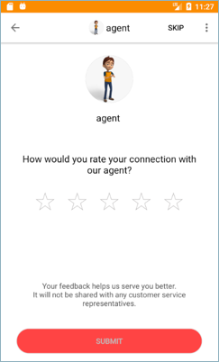
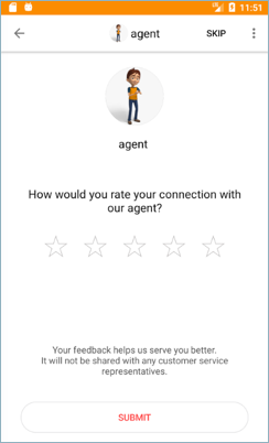
Survey screen
csatSurveyExpirationInMinutes
Expiration of CSAT in minutes from the moment the conversation was ended. If Survey exceeded the expiration, it does not present to the user.
- Type: integer
- Default value: 1440
feedback_fragment_background_color
Background color for the feedback dialog.
- Type: color
- Default value: @color/lp_colorBackground
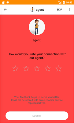
feedback_fragment_title_question
Title color for the feedback dialog.
- Type: color
- Default value: @color/lp_colorOnSurface
feedback_fragment_star
Start color for the feedback dialog.
- Type: color
- Default value: @color/lp_feedback_option_selectedColor
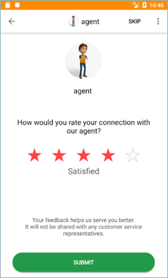
feedback_fragment_rate_text
Rating title color for the feedback dialog.
- Type: color
- Default value: @color/lp_colorOnBackground0
feedback_fragment_title_yesno
Yes and no color for the feedback dialog.
- Type: color
- Default value:@color/lp_colorOnBackground0
feedback_fragment_yesno_btn_selected_background
Background color of the yes or no selected in the feedback dialog.
- Type: color
- Default value: @color/lp_feedback_option_selectedColor
feedback_fragment_yesno_btn_default_background
Default background of the yes and no of the feedback dialog.
- Type: color
- Default value: @color/lp_colorSurface
feedback_fragment_yesno_btn_text_selected
Text color for the yes/no buttons when selected in the feedback dialog.
- Type: color
- Default value: @color/lp_colorOnSurface
feedback_fragment_yesno_btn_text_default
Feedback dialog yes/no text color when in default.
- Type: color
- Default value: @color/lp_consumer_action_highLight_color
feedback_fragment_yesno_btn_stroke_default
Feedback dialog yes/no stroke color when in default.
- Type: color
- Default value: @color/lp_colorSurface
feedback_fragment_yesno_btn_stroke_selected
Feedback dialog yes/no stroke color when selected.
- Type: color
- Default value: @color/lp_feedback_option_selectedColor
feedback_fragment_yesno_btn_stroke_width_default
Feedback dialog yes/no stroke width size when in default.
- Type: dimen
- Default value: 1dp
feedback_fragment_yesno_btn_stroke_width_selected
Feedback dialog yes/no stroke width size when in selected.
- Type: dimen
- Default value: 1dp
feedback_fragment_submit_message
Feedback dialog submit message text color.
- Type: color
- Default value: @color/lp_colorOnBackground0
feedback_fragment_submit_btn_enabled
Feedback dialog submit button color when enabled.
- Type: color
- Default value: @color/lp_feedback_option_selectedColor
feedback_fragment_submit_btn_text_enabled
Feedback dialog submit button text color when enabled.
- Type: color
- Default value: @color/lp_colorOnSurface
feedback_fragment_submit_btn_disabled
Feedback dialog submit button color when disabled.
- Type: color
- Default value: @color/lp_colorSurface
feedback_fragment_submit_btn_text_disabled
Feedback dialog submit button text color when disabled.
- Type: color
- Default value: @color/lp_consumer_action_highLight_color
feedback_fragment_submit_btn_stroke_enabled
Feedback dialog submit button stroke color when enabled.
- Type: color
- Default value: @color/lp_feedback_option_selectedColor
feedback_fragment_submit_btn_stroke_disabled
Feedback dialog submit button stroke color when disabled.
- Type: color
- Default value: @color/lp_colorSurface
feedback_fragment_submit_btn_stroke_width_enabled
Feedback dialog submit button stroke width size when enabled.
- Type: dimen
- Default value: 1dp
feedback_fragment_submit_btn_stroke_width_disabled
Feedback dialog submit button stroke width size when disabled.
- Type: dimen
- Default value: 1dp

feedback_fragment_agent_details_name
Define the color of the agent name on agent details section in feedback dialog.Visible only if show_agent_details_csat is set to true.
- Type: color
- Default value: @color/lp_colorOnSurface
feedback_fragment_submitted_thank_you_text_color
Feedback dialog thank you message text color when when feedback is submitted
- Type: color
- Default value: @color/lp_colorOnSurface
show_feedback
Defines whether to show the feedback dialog.
- Type: bool
- Default value: true
show_agent_details_csat
Define if the agent’s name and avatar are visible on top of feedback dialog.
If both show_yes_no_question and show_agent_details_csat are set to true, then show_yes_no_question gets ignored and hidden.
- Type: bool
- Default value: true (show)
show_yes_no_question
Defines whether to show or hide the yes/no question in the feedback dialog (true=show, false=hide).
If both show_yes_no_question and show_agent_details_csat are set to true, then show_yes_no_question gets ignored and hidden.
- Type: bool
- Default value: true
show_csat_thank_you
Define if "thank you" screen will appear after submitting the survey.
- Type: bool
- Default value: true (show)
button_corner_radius
Makes CSAT Yes/No and Submit buttons corner radiuses customizable (through dimens.xml).
- Type: dimen
- Default value: 30dp
Foreground service
upload_photo_using_service
Enable or disable uploading/downloading of files using the foreground service.
- Type: bool
- Default value: true
Speech recognition
lp_speech_recognition_enabled
Enable or disable speech recognition feature.
- Type: bool
- Default value: false
lp_speech_recognition_icon_color
Specifies a color filter that is applied to a speech recognition icon.
- Type: color
- Default value: @android:color/darker_gray
lp_speech_recognition_input_complete_silence_length_millis
The amount of time in milliseconds that it should take after the recognizer stops hearing speech to consider the input complete hence end the recognition session.
- Type: integer
- Default value: 10000
Date Picker
dateTitlePaddingBottom
Date Picker title padding bottom.
- Type: dimen
- Default value: 5dp
dayOfMonthBoxSize
Box size of day of month.
- Type: dimen
- Default value: 44dp
dayOfMonthImageMarginTop
Margin top of day of month image
- Type: dimen
- Default value: 32dp
dayOfMonthImageSize
Image size of day of month.
- Type: dimen
- Default value: 4dp
dayOfMonthMinHeight
Min height of day of month.
- Type: dimen
- Default value: 0dp
dayOfMonthMinWidth
Min Width of day of month.
- Type: dimen
- Default value: 50dp
dayOfMonthPaddingBottom
Bottom padding of day of month.
- Type: dimen
- Default value: 0dp
dayOfMonthSize
Size of day of month.
- Type: dimen
- Default value: 34dp
lp_datepicker_close_btn_size
Date Picker header close button size.
- Type: dimen
- Default value: 54dp
lp_datepicker_confirm_btn_text_size
Date Picker header confirm button text size.
- Type: dimen
- Default value: 16sp
lp_header_padding_end
Date Picker header padding end.
- Type: dimen
- Default value: 8dp
lp_header_padding_start
Date Picker header padding start.
- Type: dimen
- Default value: 24dp
lp_header_text_size
Date Picker header text size.
- Type: dimen
- Default value: 24sp
text_size_date
Date Picker date text size.
- Type: dimen
- Default value: 18sp
text_size_title
Date Picker title size.
- Type: dimen
- Default value: 22sp
text_size_week
Date Picker week days text size.
- Type: dimen
- Default value: 15sp
weekDaysPaddingBottom
Date Picker week days padding bottom.
- Type: dimen
- Default value: 0dp
weekRowMinHeight
Min height of Date Picker week row
- Type: dimen
- Default value: 44dp
lp_datepicker_calendar_bg_color
Color code for calendar background color.
- Type: color
- Default value: @color/lib_dp_calendar_bg_color
lp_datepicker_close_button_fill_color
Color code for fill color of close button od Date Picker header.
- Type: color
- Default value: @color/lib_dp_close_button_fill_color

lp_datepicker_close_button_stroke_color
Color code for stroke color of close button od Date Picker header.
- Type: color
- Default value: @color/lib_dp_close_button_stroke_color
lp_datepicker_confirmation_arrow_color
Color code for arrow color od the confirmation view.
- Type: color
- Default value: @color/lib_dp_confirmation_arrow_color
lp_datepicker_confirmation_bg_color
Color code for confirmation background color od the confirmation view.
- Type: color
- Default value: @color/lib_dp_confirmation_bg_color
lp_datepicker_confirmation_button_bg_color
Color code for confirmation button background color od the confirmation view.
- Type: color
- Default value: @color/lib_dp_confirmation_button_bg_color
lp_datepicker_confirmation_button_text_color
Color code for confirmation button od the confirmation view.
- Type: color
- Default value: @color/lib_dp_confirmation_button_text_color

lp_datepicker_confirmation_info_text_color
Color code for info text color od the confirmation view.
- Type: color
- Default value: @color/lib_dp_confirmation_info_text_color

lp_datepicker_default_date_color
Color code for default date color of calendar.
- Type: color
- Default value: @color/lib_dp_default_date_color
lp_datepicker_disable_date_color
Color code for disable date color of calendar.
- Type: color
- Default value: @color/lib_dp_disable_date_color
lp_datepicker_divider_color
Color code for divider color of Date Picker header.
- Type: color
- Default value: @color/lib_dp_divider_color
lp_datepicker_dropdown_arrow_color
Color code for dropdown arrow color of Date Picker Spinner.
- Type: color
- Default value: @color/lib_dp_dropdown_arrow_color
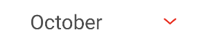
lp_datepicker_dropdown_item_bg_color
Color code for dropdown item background color of Date Picker Spinner.
- Type: color
- Default value: @color/lib_dp_dropdown_item_bg_color
lp_datepicker_header_bg_color
Color code for background color of the Date Picker header.
- Type: color
- Default value: @color/lib_dp_header_bg_color
lp_datepicker_header_text_color
Color code for text color of the Date Picker header.
- Type: color
- Default value: @color/lib_dp_header_text_color
lp_datepicker_month_year_text_color
Color code for year and month text color of Date Picker Spinner.
- Type: color
- Default value: @color/lib_dp_month_year_text_color
lp_datepicker_ranged_date_color
Color code for range date color of calendar.
- Type: color
- Default value: @color/lib_dp_range_date_color
lp_datepicker_range_bg_color
Color code for range background color of calendar.
- Type: color
- Default value: @color/lib_dp_range_bg_color
lp_datepicker_selected_date_circle_color
Color code for selected date circle color of calendar.
- Type: color
- Default value: @color/lib_dp_selected_date_circle_color
lp_datepicker_selected_date_color
Color code for selected date color of calendar.
- Type: color
- Default value: @color/lib_dp_selected_date_color
lp_datepicker_weekday_title_color
Color code for calendar weekday title color.
- Type: color
- Default value: @color/lib_dp_weekday_title_color
Structured Content
enable_structured_content
Enable or disable structured content feature.
- Type: bool
- Default value: false
structured_content_border_color
Color code for the structured content bubble outline color.
- Type: color
- Default value: @color/lp_agent_message_bubble_color
lp_structured_content_button_min_height
Configuration for min height of the structured content bubble.
- Type: dimen
- Default value: 36dp
lpui_sc_button_border_radius
Configuration dp for structured content button border radius
- Type: dimen
- Default value: 16dp
lpui_sc_button_border_width
Configuration for structured content button border width
- Type: dimen
- Default value: 1dp
lpui_sc_button_margin
Configuration for structured content button margin
- Type: dimen
- Default value: 10dp
lpui_sc_button_padding
Configuration for structured content button padding
- Type: dimen
- Default value: 5dp
structured_content_border_width
Integer in dp for the bubble stroke width of the structured content bubble.
- Type: dimen
- Default value: 1dp
structured_content_map_zoom
Integer that defines the zoom level of the structured content map view. For more details, see Google map API.
- Type: integer
- Default value: 18
structured_content_link_as_callback
Set the Structured Content link as a callback (true) instead of a deep link intent (false).
- Type: bool
- Default value: false (deep link intent)
lp_google_maps_key
Set the host app's Google Map key to enable map views in Structured Content.
- Type: string
- Default value: no value
structured_content_background_color
The color of the background of structured content elements.
- Type: color
- Default value: @color/lp_transparent
structured_content_bottom_right_radius
Configuration for bottom right corner radius of structured content card.
- Type: dimen
- Default value: 5dp
structured_content_top_left_radius
Configuration for top left corner radius of structured content card.
- Type: dimen
- Default value: 5dp
structured_content_top_right_radius
Configuration for top right corner radius of structured content card.
- Type: dimen
- Default value: 5dp
structured_content_bottom_left_radius
Configuration for bottom left corner radius of structured content card.
- Type: dimen
- Default value: 5dp
structured_content_button_background_enabled
Enable or disable structured content button border.
- Type: bool
- Default value: true
structured_content_button_no_text_lines
Configuration to fit number of text lines in structured content button element. When set to 0, the button will grow to wrap multiple text lines to fit in the entire text.
- Type: integer
- Default value: 1
sc_buttonElement_text_color
The color of text elements in structured content.
- Type: color
- Default value: @color/lp_consumer_action_highLight_color
sc_buttonElement_background_color
The color of button in button elements in structured content.
- Type: color
- Default value: @color/lp_colorSurface
sc_disabled_buttonElement_text_color
The text color of blocked button elements in structured content.
- Type: color
- Default value: @color/lp_dark_gray_1
sc_disabled_buttonElement_background_color
The background color of blocked button elements in structured content.
- Type: color
- Default value: @color/lp_gray
sc_textElement_text_color
The color of text in text elements in structured content.
- Type: color
- Default value: @color/lp_onAgentMessage_bubble_color
sc_textElement_background_color
The color of the background of structured content text elements.
- Type: color
- Default value: @color/lp_transparent
lp_sc_carousel_navigation_buttons_appearance
Configuration is responsible for the carousel navigation buttons' appearance. Could be equal to such values:
- 0 - Carousel navigation buttons are not visible.
- 1 - SDK represents carousel navigation buttons if TalkBack mode is enabled.
-
2 - Carousel navigation buttons are always visible.
- Type: integer
- Default value: 0
- Available since: 5.20.2
lp_carousel_navigation_button_gravity
Configuration for structured content carousel navigation button gravity appearance. Could be equal to such values:
- 0 - Navigation buttons will be placed above structured content carousel view.
- 1 - Navigation buttons will be placed within structured content carousel view. Centered vertically.
-
2 - Navigation buttons will be placed below structured content carousel view.
- Type: integer
- Default value: 0
- Available since: 5.24.1
lp_carousel_navigation_button_size
Defines structured content carousel navigation button's size (Both width and height).
- Type: dimen
- Default value: 36dp
- Available since: 5.20.2
lp_carousel_navigation_button_corner_radius
Defines structured content carousel navigation button's corner radius.
- Type: dimen
- Default value: 18dp
- Available since: 5.20.2
lp_carousel_navigation_buttons_margin
Defines structured content carousel navigation button's horizontal margins from structured content container.
- Type: dimen
- Default value: 8dp
- Available since: 5.20.2
lp_carousel_navigation_buttons_vertical_margin
Defines structured content carousel navigation button's vertical margins from structured content container and carousel view.
- Type: dimen
- Default value: 8dp
- Available since: 5.24.1
lp_carousel_navigation_button_color
Defines structured content carousel navigation button's background color.
- Type: color
- Default value: #448AFF
- Available since: 5.20.2
lp_carousel_navigation_button_icon_color
Defines structured content carousel navigation button's icon tint color.
- Type: color
- Default value: #FFFFFF
- Available since: 5.20.2
lp_carousel_navigation_move_to_previous_icon
Defines structured content carousel navigation move-to-previous button's drawable resource.
- Type: drawable
-
Default value:
@drawable/ic_carousel_move_to_previous - Available since: 5.20.2
lp_carousel_navigation_move_to_next_icon
Defines structured content carousel navigation move-to-next button's drawable resource.
- Type: drawable
-
Default value:
@drawable/ic_carousel_move_next - Available since: 5.20.2
System messages
system_bubble_text_color
Color code for the text of the system messages.
- Type: color
- Default value: @color/lp_colorOnBackground0
Time to Response and Off Hours
disableTTRPopup
Defines whether to disable the TTR snackbar popup (true=disable) false by default.
- Type: bool
- Default value: false
When the auto messages feature is enabled, TTR notifications do not display when the auto messages feature is enabled, regardless of the value set for this attribute.
show_timestamp_in_ttr_notification
When true the TTR snackbar will display the time until the agent responds. If set to false, a general message is displayed.
- Type: bool
- Default value: true
ttr_duration
Set the duration that the TTR snackbar will be visible (ms).
- Type: integer
- Default value: 3000
ttrFirstTimeDelaySeconds
Set the time in seconds before the first the TTR snackbar will be displayed.
- Type: integer
- Default value: 10
ttr_message_off_hours_enabled
Defines whether to show the off hours snackbar popup (true=enable).
- Type: bool
- Default value: true
ttrShowFrequencyInSeconds
Define the frequency of the TTR (time to response) messages.
- Type: integer
- Default value: 8
Unread Messages
unread_indicator_bubble_enable
Toggle the mode of the unread_indicator_bubble_enable. If unread_indicator_bubble_enable is disabled, the "scroll to bottom" button will scroll to bottom of the conversation but the count indicator and message preview will not be displayed".
Note: Regardless of unread_indicator_bubble_enable value, the conversation screen will always scrolls to the last position where the user left off.
- Type: bool
- Default value: true
unread_indicator_bubble_text_color
Enable or disable the unread message indicator (shown or invisible) - true by default.
- Type: color
- Default value: @color/lp_unread_messages_count_highLight_color
unread_indicator_bubble_background_color
Color code for the background of the unread messages bubble.
- Type: color
- Default value: @color/lp_colorSurface
Bubbles
agent_bubble_stroke_width
Int number for the outline width.
- Type: dimen
- Default value: 0dp
agent_bubble_stroke_color
Color code for the outline color.
- Type: color
- Default value: @color/lp_agent_message_bubble_color

agent_bubble_message_text_color
Color code for the text of the agent bubble.
- Type: color
- Default value: @color/lp_onAgentMessage_bubble_color

agent_bubble_message_link_text_color
Color code for links in the text of the agent bubble.
- Type: color
- Default value: @color/lp_consumer_action_highLight_color
agent_bubble_timestamp_text_color
Color code for the timestamp of the agent bubble.
- Type: color
- Default value: @color/lp_colorOnBackground1
agent_bubble_background_color
Color code for the background of the agent bubble.
- Type: color
- Default value: @color/lp_agent_message_bubble_color
agent_avatar_background_color
Color code for the background of the agent default avatar next to the bubble.
- Type: color
- Default value: #949596
agent_avatar_icon_color
Color code for the agent default icon in the avatar next to the bubble.
- Type: color
- Default value: @android:color/white
agent_bubble_link_preview_background_color
Color code for the background of the agent bubble when url is presented.
- Type: color
- Default value: @color/lp_transparent
agent_bubble_link_preview_background_stroke_color
The border color of the link preview bubble sent by the agent.
- Type: color
- Default value: @color/lp_transparent
agent_bubble_link_preview_background_stroke_width
The border width of the link preview bubble sent by the agent.
- Type: dimen
- Default value: 1dp
agent_bubble_link_preview_title_text_color
Color code for the background of the agent title text color when url is presented.
- Type: color
- Default value: @color/lp_colorOnBackground0
agent_bubble_link_preview_description_text_color
Color code for the background of the agent description text color when url is presented.
- Type: color
- Default value: @color/lp_colorOnBackground1
agent_bubble_message_markdown_hyperlink_text_color
Set the link message text color.
- Type: color
- Default value: @color/lp_consumer_action_highLight_color
agent_bubble_pci_form_invitation_background_color
background color of the form invitation bubble
- Type: color
- Default value: @color/lp_colorSurface
agent_bubble_pci_form_invitation_background_btn_color
background color of the form invitation button only
- Type: color
- Default value: @color/lp_colorSurface
agent_bubble_pci_form_invitation_stroke_color
color of the stroke (border) of the form invitation bubble.
- Type: color
- Default value: @color/lp_agent_message_bubble_color
agent_bubble_pci_form_invitation_button_text_color
color of the text on PCI form invitation bubble button
- Type: color
- Default value: @color/lp_consumer_action_highLight_color
agent_bubble_pci_form_invitation_description_text_color
Text color on the description in the PCI form invitation bubble.
- Type: color
- Default value: @color/lp_colorOnBackground1
agent_bubble_pci_form_invitation_title_text_color
text color on the title in the PCI form invitation bubble.
- Type: color
- Default value: @color/lp_colorOnSurface
agent_bubble_pci_form_invitation_icon_tint_color
color of the icon in the PCI form invitation bubble.
- Type: color
- Default value: @color/lp_consumer_action_highLight_color
agent_bubble_pci_form_invitation_progressBar_color
color of progress bar
- Type: color
- Default value: @color/lp_progress_bar_color
- Available since: 5.23
chat_bubble_padding_right
Chat message (agent/consumer) bubble right padding.
- Type: dimen
- Default value: 8dp

bot_bubble_stroke_width
Int number for the outline width for message sent by bot.
- Type: dimen
- Default value: 0dp
- Available since5.23.0
bot_bubble_stroke_color
Color code for the outline color for message sent by bot.
- Type: color
- Default value: @color/agent_bubble_stroke_color
- Available since5.23.0
bot_bubble_message_text_color
Color code for the text of the bot bubble.
- Type: color
- Default value: @color/agent_bubble_message_text_color
- Available since5.23.0
bot_bubble_message_link_text_color
Color code for links in the text of the bot bubble.
- Type: color
- Default value: @color/agent_bubble_message_link_text_color
- Available since5.23.0
bot_bubble_timestamp_text_color
Color code for the timestamp of the bot bubble.
- Type: color
- Default value: @color/agent_bubble_timestamp_text_color
- Available since5.23.0
bot_bubble_background_color
Color code for the background of the bot bubble.
- Type: color
- Default value: @color/agent_bubble_background_color
- Available since5.23.0
bot_avatar_background_color
Color code for the background of the bot default avatar next to the bubble.
- Type: color
- Default value: @color/agent_avatar_background_color
- Available since5.23.0
bot_avatar_icon_color
Color code for the bot default icon in the avatar next to the bubble.
- Type: color
- Default value:@color/agent_avatar_icon_color
- Available since5.23.0
bot_bubble_link_preview_background_color
Color code for the background of the bot bubble when url is presented.
- Type: color
- Default value: @color/agent_bubble_link_preview_background_color
- Available since5.23.0
bot_bubble_link_preview_background_stroke_color
The border color of the link preview bubble sent by the bot.
- Type: color
- Default value: @color/agent_bubble_link_preview_background_stroke_color
- Available since: 5.23.0
bot_bubble_link_preview_background_stroke_width
The border width of the link preview bubble sent by the bot.
- Type: dimen
- Default value: @dimen/agent_bubble_link_preview_background_stroke_width
- Available since: 5.23.0
bot_bubble_link_preview_title_text_color
Color code for the background of the bot title text color when url is presented.
- Type: color
- Default value: @color/agent_bubble_link_preview_title_text_color
- Available since5.23.0
bot_bubble_link_preview_description_text_color
Color code for the background of the bot description text color when url is presented.
- Type: color
- Default value: @color/agent_bubble_link_preview_description_text_color
- Available since5.23.0
bot_bubble_message_markdown_hyperlink_text_color
Set the link message text color in messages sent by bot.
- Type: color
- Default value: @color/agent_bubble_message_markdown_hyperlink_text_color
- Available since: 5.23.0
lp_messaging_ui_ic_bot_avatar
- Type: drawable
- Available since: 5.23.0
Default bot avatar appearing next to a bot’s bubble when no avatar URL is assigned on Conversational Cloud and on agent avatar appearing on the action bar.
If you want to define the background color for this avatar, override bot_avatar_background_color resource ID.
chat_bubble_padding_left
Chat message (agent/consumer) bubble left padding.
- Type: dimen
- Default value: 8dp
chat_bubble_padding_top
Chat message (agent/consumer) bubble top padding.
- Type: dimen
- Default value: 8dp
chat_bubble_padding_bottom
Chat message (agent/consumer) bubble bottom padding.
- Type: dimen
- Default value: 8dp
lp_timestamps_font_size
Update the timestamp text font size of the conversation message bubbles.
- Type: dimen
- Default value: 12sp
show_agent_typing_in_message_bubble
True: The agent-is-typing-indicator appears in "temporary" bubble and the style is available in both fragment and activity modes.
False: The agent-is-typing-indicator appears in the status bar (under the agent name) and the style is available only in activity mode.
Only available as long as the announce_agent_typing configuration is on (set as true).
- Type: bool
- Default value: false

If you want to present a different animation or image, create a file and name it lp_messaging_ui_typing_animation_frames.xml to override the SDK's original animation.
Default value: LivePerson animation
consumer_bubble_stroke_width
integer in dp for the bubble stroke width of the consumer bubble.
- Type: dimen
- Default value: 1dp
consumer_bubble_message_text_color
Color code for the text of the consumer bubble.
- Type: color
- Default value: @color/lp_onConsumerMessage_bubble_color
consumer_bubble_message_link_text_color
Color code for links in the text of the consumer bubble.
- Type: color
- Default value: @android:color/white

consumer_bubble_timestamp_text_color
Color code for the timestamp of the consumer bubble.
- Type: color
- Default value: @color/lp_colorOnBackground1
consumer_bubble_background_color
Color code for the background of the consumer bubble.
- Type: color
- Default value: @color/lp_consumer_message_bubble_color
consumer_bubble_state_text_color
Color code for state text next to the consumer bubble.
- Type: color
- Default value: @color/lp_colorOnBackground1
consumer_bubble_stroke_color
Color code for the stroke of the consumer bubble.
- Type: color
- Default value: @color/lp_consumer_message_bubble_color
consumer_bubble_link_preview_background_color
Color code for the background of the consumer bubble when url is presented.
- Type: color
- Default value:@color/lp_transparent
consumer_bubble_link_preview_title_text_color
Color code for the background of the consumer title text color when url is presented.
- Type: color
- Default value: @color/lp_colorOnBackground0
consumer_bubble_link_preview_description_text_color
Color code for the background of the consumer description text color when url is presented.
- Type: color
- Default value: @color/lp_colorOnBackground1
consumer_bubble_read_status_color
Color code for the read status icon (if enable).
- Type: color
- (Light Theme)Default value: #df78ef (purple dark)
- (Dark Theme)Default value: #df78ef (purple light)
consumer_bubble_received_status_color
Color code for the received status icon (if enable).
- Type: color
- Default value: #CECECE
consumer_bubble_sent_status_color
Color code for the sent status icon (if enable).
- Type: color
- Default value: #CECECE
consumer_bubble_sending_status_color
Color code for the sending status icon (if enable).
- Type: color
- Default value: #949596 (gray)
consumer_bubble_link_preview_background_stroke_color
The border color of the link preview bubble sent by the consumer.
- Type: color
- Default value: @color/lp_linkPreviewColor
consumer_bubble_link_preview_background_stroke_width
The border width of the link preview bubble sent by the consumer.
- Type: dimen
- Default value: 1dp
consumer_bubble_voice_play_button_color
Color code for audio play button icon.
- Type: color
- Default value: #EDEDED
consumer_bubble_voice_pause_button_color
Color code for audio pause button.
- Type: color
- Default value: #EDEDED
consumer_bubble_voice_download_button_color
Color code for audio download button.
- Type: color
- Default value: #EDEDED
consumer_bubble_voice_progressBar_tint
Color code for playing audio progress tint.
- Type: color
- Default value: @color/lp_progress_bar_color
consumer_bubble_voice_downloading_progress
Color code for audio download progress spinner.
- Type: color
- Default value: @color/lp_progress_bar_color
consumer_bubble_voice_duration_textView_color
Color of audio limit in text view.
- Type: color
- Default value: #FFFFFF
end_bubble_bottom_left_radius
Corner radius of bottom left consumer bubbles (on the right side).
- Type: dimen
- Default value: 10dp, bottom_right is 0dp
end_bubble_top_left_radius
Corner radius of top left consumer bubbles (on the right side).
- Type: dimen
- Default value: 10dp, bottom_right is 0dp
end_bubble_top_right_radius
Corner radius of top right consumer bubbles (on the right side).
- Type: dimen
- Default value: 10dp, bottom_right is 0dp
end_bubble_bottom_right_radius
Corner radius of bottom right consumer bubbles (on the right side).
- Type: dimen
- Default value: 10dp, bottom_right is 0dp
start_bubble_bottom_left_radius
Corner radius of the bottom left agent/brand bubbles (on the left side).
- Type: dimen
- Default value: 10dp, bottom_left is 0dp
start_bubble_top_left_radius
Corner radius of the top left agent/brand bubbles (on the left side).
- Type: dimen
- Default value: 10dp, bottom_left is 0dp
start_bubble_top_right_radius
Corner radius of the top right agent/brand bubbles (on the left side).
- Type: dimen
- Default value: 10dp, bottom_left is 0dp
start_bubble_bottom_right_radius
Corner radius of the bottom right agent/brand bubbles (on the left side).
- Type: dimen
- Default value: 10dp, bottom_left is 0dp
unread_indicator_bubble_radius
Corner radius of the unread messages bubble.
- Type: dimen
- Default value: 20dp for all the corners
enable_markdown_hyperlink
Enable or disable hyperlink support. Agent won’t be able to send hyperlink messages if set to false.
- Type: bool
- Default value: true

lp_markdown_hyperlink_copy_text_only
Define the copy content of a link message. Copying the message will copy both message and hyperlink. Only the message will be copied if set to true.
- Type: bool
- Default value: false
lp_messaging_ui_ic_agent_avatar
Default agent avatar appearing next to an agent’s bubble when no avatar URL is assigned on Conversational Cloud and on agent avatar appearing on the action bar.
If you want to define the background color for this avatar, override agent_avatar_background_color resource ID.
lp_messaging_ui_brand_logo
Default brand avatar on the avatar next to brand bubble (the first brand message) and on agent avatar appearing on the action bar before an agent is assigned.
If you want to define the background color for this avatar, override brand_logo_background_color resource ID. Only relevant for bubble brand’s avatar.
Background color of the agent avatar on action bar is agent_avatar_background_color.
lp_enable_timestamps
Show or hide the timestamp text of the conversation message bubbles.
- Type: bool
- Default value: true
lp_enable_read_receipts
Show or hide read receipt text of the consumer message bubbles.
- Type: bool
- Default value: true
Alert dialog
lp_alert_dialog_background_color
Background color of alert dialog.
- Type: color
- Default value: @color/lp_colorSurface
lp_alert_dialog_accentColor
Color of alert dialog buttons.
- Type: color
- (Light Theme)Default value: #3B8471
- (Dark Theme)Default value: #20BF9F
lp_alert_dialog_title_description_color
Color of title and description of alert dialog.
- Type: color
- Default value: @color/lp_colorOnSurface
Action Mode
lp_action_mode_background_color
Action mode background color.
- Type: color
- Default value: @color/lp_colorOnSurface
lp_action_mode_menuText_color
- Type: color
- Default value: @color/lp_textColorSecondary
lp_action_mode_closeBtn_color
- Type: color
- Default value: @color/lp_textColorSecondary
Schedule Slot List
lp_appointment_header_background_color
Appointment Scheduler window header background color.
- Type: color
- (Light Theme) Default value: #0363AD
- (Dark Theme) Default value: #2E2E2E
lp_appointment_header_text_color
Appointment Scheduler window text color code for title, date and confirm button (enabled) on header.
- Type: color
- (Light Theme) Default value: #FFFFFF
- (Dark Theme) Default value: #FFFFFF
lp_appointment_week_day_title_color
Color code for week days text: S, M, T, W, …
- Type: color
- (Light Theme) Default value: #000000
- (Dark Theme) Default value: #FCFCFD
lp_appointment_week_date_text_color
Color code for week date text color
- Type: color
- (Light Theme) Default value: #ADBACC
- (Dark Theme) Default value: #ADBACC
lp_appointment_week_day_active_text_color
Color code for an active calendar day where appointments are available.
- Type: color
- (Light Theme) Default value: #000000
- (Dark Theme) Default value: #FCFCFD
lp_appointment_week_day_inactive_text_color
Color code for an in-active calendar day where appointments are not available.
- Type: color
- (Light Theme) Default value: #ADBACC
- (Dark Theme) Default value: #ADBACC
lp_appointment_disabled_confirm_btn_color
Color code for Confirm button (disabled) when no appointment is selected.
- Type: color
- (Light Theme) Default value: #ADBACC
- (Dark Theme) Default value: #ADBACC
lp_appointment_divider_fill_color
Color code for an appointment's divider.
- Type: color
- (Light Theme) Default value: #000000
- (Dark Theme) Default value: #FCFCFD
lp_appointment_scheduler_background_color
Color code for background color of scheduler window.
- Type: color
- (Light Theme) Default value: #FFFFFF
- (Dark Theme) Default value: #000000
lp_appointment_selected_background_color
Color code for currently selected appointment slot.
- Type: color
- (Light Theme) Default value: #0363AD
- (Dark Theme) Default value: #BA86FC
lp_appointment_title_text_color
Color code for an appointment's title and description for un-selected slots.
- Type: color
- (Light Theme) Default value: #DE000000
- (Dark Theme) Default value: #DEFFFFFF
lp_appointment_selected_title_text_color
Color code for an appointment's title and description when slot is currently selected.
- Type: color
- (Light Theme) Default value: #FFFFFF
- (Dark Theme) Default value: #DE000000
lp_appointment_time_text_color
Color code for an appointment's time for un-selected slots.
- Type: color
- (Light Theme) Default value: #000000
- (Dark Theme) Default value: #FFFFFF
lp_appointment_selected_time_text_color
Color code for an appointment's time when slot is currently selected.
- Type: color
- (Light Theme) Default value: #FFFFFF
- (Dark Theme) Default value: #000000
lp_appointment_available_date_format
Configuration to set available date format on appointment scheduler window.
- Type: String
- Default value: yyyyMMdd
lp_appointment_close_button_label
Configuration to set close button appointment scheduler window.
- Type: String
- Default value: Close
lp_appointment_confirm_button
Configuration to set confirm button appointment scheduler window.
- Type: String
- Default value: Confirm
lp_appointment_confirm_button_text
Configuration to set text on confirm button on appointment scheduler window.
- Type: String
- Default value: @string/lp_appointment_confirm_button
lp_appointment_default_header_title
Configuration to set header title on appointment scheduler window.
- Type: String
- Default value: SCHEDULE APPOINTMENT
lp_appointment_header_date_format
Configuration to set date format of a header date on the appointment scheduler window.
- Type: String
- Default value: EEE, MMM d
lp_appointment_time_format
Configuration to set time format of all appointment slots.
- Type: String
- Default value: hh:mm aaa
lp_appointment_week_date_format
Configuration to set date format of a current week's date on the appointment scheduler window.
- Type: String
- Default value: MMMM yyyy
lp_aptlist_close_btn_size
Configuration to set close button size on appointment window.
- Type: dimen
- Default value: 54dp
lp_header_text_size
Configuration to set header text size of the appointment window.
- Type: dimen
- Default value: 24sp
Proactive and IVR Deflection to App Messaging
show_outbound_in_app_message
- This configuration allows brands that want to display the outbound message in the in-app conversation interface to consumers even after they discard or ignore the message notification.
- In case the consumer did not tap on the push notification to navigate to the in-app conversation, this configuration can be set to true if the brand wants to display the outbound message to the consumer even in the case that the look back period has expired. If set to false, the outbound message will not be displayed to consumers once they navigate to the in-app conversation screen from the app.
- Type: bool
- Default value: false
lp_fetch_pending_proactive_messages
- When true the SDK will fetch the pending proactive messages implicitly alongside fetching the other history messages in loading conversation screen process.
- Type: bool
- Default value: false
- Available since: 5.23.1
PushUnregisterType
Brands can choose either of the following configurations to unregister user from pusher:
enum class PushUnregisterType {
    NONE,
    ALL,
    AGENT
}
NONE: Do not unregister from pusher at all. Consumer will receive push notifications from both agent as well as outbound notification.
ALL (Default): Unregister/remove consumer from pusher. No push notifications will be sent if the consumer is logged out.
AGENT: Unregister only for agent push notification messages. Consumers will still receive outbound push notifications sent from the Proactive or Connect to Messaging (IVR) services.
Pusher
lp_pusher_clear_badge_count
Enable this configuration (true) to let SDK clear all unread badge counts from Pusher.
- Type: bool
- Default value: false
Offline messaging
lp_is_offline_messaging_enabled
Enable this configuration (true) to allow consumers to type and send messages even if there is no internet connection or while the SDK is still trying to connect to the server.
- Type: bool
- Default value: false
lp_is_offline_welcome_message_enabled
Enable this configuration (true) to show a welcome message at the bottom of the conversation screen if the consumer sent some messages while there was no active conversation and the SDK was still trying to connect to the server.
- Type: bool
- Default value: false
lp_offline_messages_for_pcs_behavior
- Type: integer
- Default value: 0
Available options:
- 0 - SDK will send all messages to the active PCS dialog.
- 1 - SDK will delete all pending offline messages.
- 2 - SDK will resolve an active PCS dialog and create a new conversation. All pending offline messages would be attached to the newly created conversation with the agent.
lp_offline_progress_bar_background_color
Background color of the offline messaging loader indicator.
- Type: color
- (Light Theme) Default value: #00000000
- (Dark Theme) Default value: #00000000
lp_offline_progress_bar_color
Color of the offline messaging loader indicator.
- Type: color
- (Light Theme) Default value: #004DC9
- (Dark Theme) Default value: #004DC9
lp_offline_progress_bar_height
Height of the offline messaging loader bar indicator.
- Type: dimen
- Default value: 3dp
lp_offline_progress_bar_weight
Width percentage of the offline messaging loader bar indicator (0 = no width, 1 = Maximum width).
- Type: integer
- Format: float
- Default value: 0.5
lp_offline_progress_bar_animation_duration
The total duration of the offline messaging loader bar indicator animations (in milliseconds).
- Type: integer
- Default value: 1250
lp_offline_progress_bar_corner_radius
Corner radius of the offline messaging loader indicator.
- Type: dimen
- Default value: 0dp
Co-Browse call
lp_cobrowse_toolbar_title_color
The configuration to change the toolbar's title color of Co-Browse call in activity mode or for picture-in-picture mode.
- Type: color
- Default value: #FFFFFF
lp_cobrowse_toolbar_background_color
The configuration to change the toolbar's background color of Co-Browse call in activity mode or for picture-in-picture mode.
- Type: color
- Default value: #222
Co-Browse picture in picture mode
lp_cobrowse_background_color
The configuration to change the background color of Co-Browse call before call is loaded in picture-in-picture mode.
- Type: color
- Default value: #222
lp_cobrowse_controls_color
The configuration to change the colorControlNormal of Co-Browse Activity theme for picture-in-picture mode.
- Type: color
- Default value: #222
lp_cobrowse_controls_color
The configuration to change the colorControlNormal of Co-Browse Activity theme for picture-in-picture mode.
- Type: color
- Default value: #fff
lp_cobrowse_controls_color
The configuration to change the colorControlNormal of Co-Browse Activity theme for picture-in-picture mode.
- Type: color
- Default value: #fff
lp_cobrowse_text_color
The configuration to change the android:textColorPrimary of Co-Browse Activity theme for picture-in-picture mode.
- Type: color
- Default value: #fff
lp_cobrowse_picture_in_picture_enabled
Enable this configuration (true) to show a cobrowse call in minified view. Note: Picture in Picture is supported on Android N (Api 24) and above. Previous versions will default to full screen call view.
- Since version: 5.27.0
- Type: bool
- Default value: false
lp_cobrowse_pip_is_light_navigation_bar
Flag to show light/dark navigation bar for Co-Browse screen in pip-mode. Note: Picture in Picture is supported on Android N (Api 24) and above. Previous versions will default to full screen call view.
- Since version: 5.27.0
- Type: bool
- Default value: false
lp_cobrowse_pip_is_light_status_bar
Flag to show light/dark status bar for Co-Browse screen in pip-mode. Note: Picture in Picture is supported on Android N (Api 24) and above. Previous versions will default to full screen call view.
- Type: bool
- Default value: false
File sharing flow
lp_is_consumer_file_caption_enabled
Enable this configuration (true) to caption preview screen before sending chosen file or taken photo.
- Type: bool
- Default value: true
Deprecated attributes
edit_text_underline_color
Color code for the Enter Message control underline color.
- Type: color
- Default value: #90CAF9
idp_num_history_conversation
Defines the number of recent conversations (including messages) to fetch from the server when loading more conversations. Only for authenticated account.
- Type: integer
- Default value: 2

lp_announce_events_sequentially
Enable or disable queue new message announcement. This controls whether AccessibilityService announces new messages sequentially or not.
- Type: bool
- Default value: false
- Removed since: 5.20.2
custom_button_icon_name
String. Custom button icon filename without extension. This will be displayed on the toolbar.
custom_button_icon_description
String. Content description for custom button. It briefly describes the view and is primarily used for accessibility support. Set this property to enable better accessibility support for your application.
notification_large_icon_name
String. The name of a resource to use as the large icon of the push notification.
enter_message_divider_visible
Bool. Determine if the Enter Message edit text divider is visible or not.
thumbnail_longer_dimension_resize
Define the size of the thumbnail image longer dimension after resizing it (pixels).
- Type: integer
- Default value: 100
- Removed since: 5.21.0. The default value = 100 will be used.