
Overview
The Button template is a simple structured card message that includes:
- Text title
- Text subtitle
- Up to 3 buttons (Facebook limitation) with either link or publish text button actions
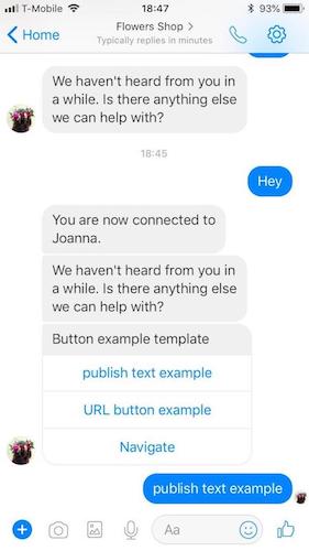
Button example image with all button actions, including publish text button tap view:
Template Properties
| Property Name | Description | Type | Required |
|---|---|---|---|
| type | Types of basic elements supported by Structured Content framework. Can be "text", “image” or “button”. If using Carousel, type of header element will always be “carousel” | Enum | Y |
| tag | Tag of template view, must be “generic”, “button” or “list” for Facebook templates. Within basic elements objects, will be “title”/”subtitle”, which will indicate what text should rendered in each of those elements (the title and subtitle have default style in Facebook) | Enum | Y |
| elements | Array of elements/templates. By using elements in your structured content template, you can send basic elements, such as simple text, images or buttons | Elements/Templates | Y |
| text | The message text in a “text” type element | String | Y |
| tooltip | Element tooltip. Used also for aira | String | N |
| url | Image URL in a “image” type element | String | Y |
| style | Basic structured content elements style object | Style elements | N |
| bold | Defines if text will be bold or not. Will always be set to ‘true’ in Facebook generic and button. | Boolean | N |
| size | Defines the element size. Will always be set to ‘large’ in Facebook generic and button | Enum — small/medium/large | N |
| button | Buttons contains click and actions properties that define the type of action set on user click operation | Object | Y |
| click | Click object contains the action type set on the click operation for each button | Object | Y |
| action | Actions are a list of applicative user actions on buttons, that will run on the consumer side and will help them to achieve their operation. Button action for Facebook generic or button can be set to Publish text or Link | Enum - “publishText”, “link” | Y |
Example Template
{
  "type": "vertical",
  "tag": "button",
  "elements": [
    {
      "type": "vertical",
      "elements": [
        {
          "type": "text",
          "tag": "title",
          "text": "Button example template",
          "tooltip": "Button example template"
        },
        {
          "type": "button",
          "tooltip": "Publish text example",
          "title": "Publish text example",
          "click": {
            "actions": [
              {
                "type": "publishText",
                "text": "published text button tap"
              }
            ]
          }
        },
        {
          "type": "button",
          "tooltip": "URL button example",
          "title": "URL button example",
          "click": {
            "actions": [
              {
                "type": "link",
                "name": "URL button tap",
                "uri": "https://www.apple.com/iphone-8/specs/"
              }
            ]
          }
        }
      ]
    }]}
Note: When using “link” as a button action, note that Facebook Messenger desktop clients use an iframe to display the web links. Your brands website will need to support iframes in order for the consumer to be able to view it from FB desktop. If the website that you are adding does not support iframes, the content will not display either (eg. Google Maps)