Introduction
The Bot Journey view in Bot Analytics provides a Sankey diagram for the bot.
What’s a Sankey diagram? In general terms, a Sankey diagram is a type of visualization used to show the flow of data between different elements. This type of diagram is often used to understand complex processes, such as those involving multiple inputs and outputs. It illustrates a data-intensive exercise, making it quick and easy to identify patterns and trends.
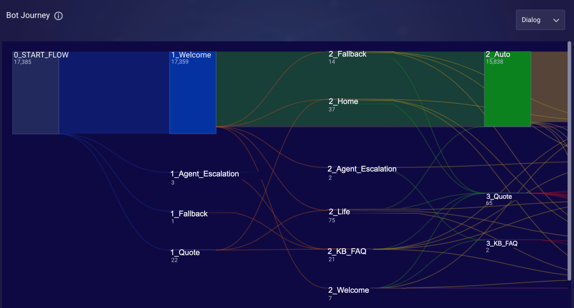
In the case of a bot, the Sankey diagram in the Bot Journey view visualizes the paths that consumers took through the bot’s dialogs, interactions, or custom events during conversations. The diagram gives you insight into conversation volume and flow. Here’s an example from an Insurance Quote bot:
Access the view
- Access Bot Analytics.
- On the dashboard, select the bot. This takes you to the Overview page.
-
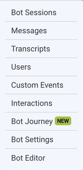
Beside the menu in the upper-left corner, click
 (More menu), and select Bot Journey from the menu.
Refine the view
- In the upper-right corner, select the desired date range to view. You can select any 60-day date range in the last 13 months.
-
In that same corner, select either Dialog, Custom events, or Interactions from the available dropdown. Do you want to see the paths that consumers took through the bot’s dialogs, interactions, or custom events during conversations?
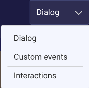
The aggregated data visualized in the diagram is based on these two selections.
Understand the view
When reading the diagram, do so from left to right. There are two main components:
- Nodes: These are boxes that represent the entities being compared in the diagram. Nodes can be dialogs, interactions, or custom events depending on how you’ve refined the view. Each node has associated input and output.
- Flows: These are lines that represent the movement of consumers between the nodes during their conversations. In other words, they visualize the paths of the conversations.
The diagram always starts with a node that identifies the total number of bot conversations within the specified date range.
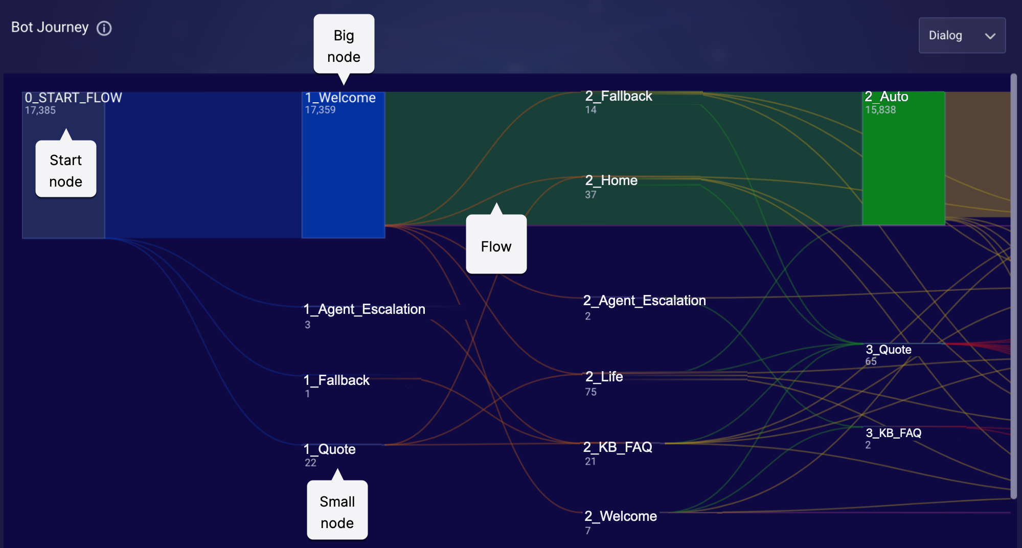
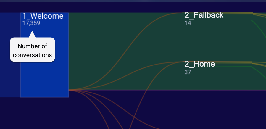
Observe in the diagram how some nodes can be big or small. The wider the node, the greater the volume of conversations routed to the node. The volume that entered the node is shown just below the node name:
Levels
Every node name is prefixed with its level number:
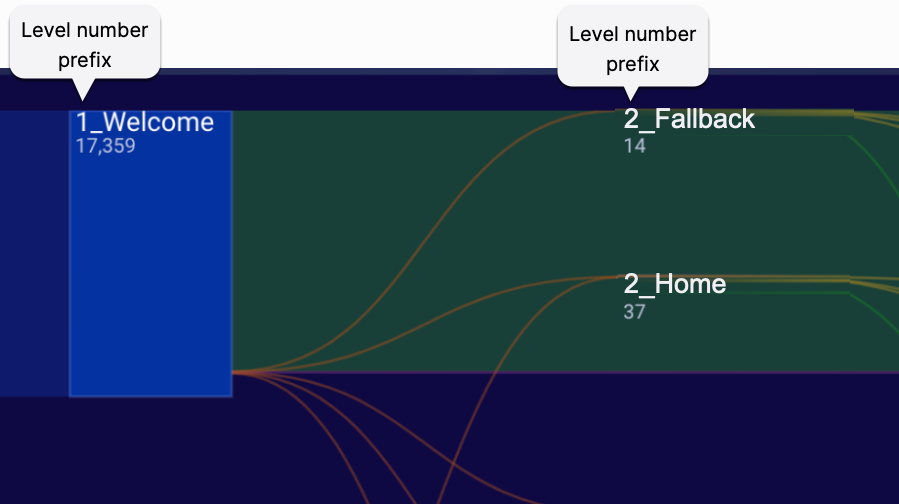
A node’s level number indicates the level in the conversation in which the node exists.
The levels depend on how the consumers moved through the bot’s blow. The first node (or start node) is always at Level 0 since it isn’t a part of the bot’s flow at all. As a conversation moves from one node (for example, dialog) to the next, the level assigned to the next node increases.
Let’s look at two examples using this diagram for an Insurance Quote bot:

Example 1: The consumer travels from the Welcome dialog (1_Welcome) to the Home dialog (2_Home), and then on to the KB FAQ dialog (3_KB_FAQ). (Note that it’s the KB FAQ dialog that’s represented in the view, not an actual article from the knowledge base.)
Example 2: The consumer travels from the Quote dialog (1_Quote) to the Fallback dialog (2_Fallback), and then back to the Quote dialog (3_Quote).
Levels range from 0 to X, where X is a number that depends entirely on the journeys that consumers took through the bot’s flow in the given time period. The more nodes encountered in conversations, the higher the number of levels represented.
There's no significance to the location of Node 2_Auto. It isn’t located in the 2nd column with the other nodes at Level 2 simply because there’s not enough room.
Gain insights
In general, use the Sankey diagram in the Bot Journey view to identify trends and locate important contributions to a particular flow. The diagram can help you answer several key questions:
- What are the paths (flows) that consumers are taking through the bot?
- How many conversations flowed to a particular dialog, interaction, or custom event?
- How often are custom events triggered in conversations?
- How many conversations are hitting the bot’s Fallback dialog/interaction? And at which levels?
Example
Let’s return to our example diagram of an Insurance Quote bot to see what insights we can gain:

The image above is just a partial view, but the full representation is shown in the table below. Like the diagram, read the table from left to right. For example, you can see that consumers entered the bot’s flow via four different dialogs at Level 1. And from the Welcome dialog, they continued on to one of seven different dialogs at Level 2. And so on.
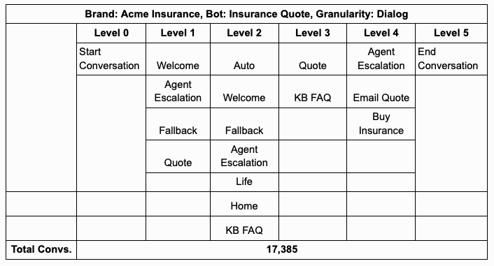
The data reveals these key insights:
- 1_Welcome: 17K conversations are routed to the Welcome dialog from the start node.
- 2_Auto: 15K of the conversations are routed to the Auto dialog, so consumer intent regarding auto insurance is high.
- 1_Fallback: Hitting the Fallback dialog indicates that some consumer intents weren’t understood by the bot. Consider reviewing unmatched phrases in Bot Analytics and add support for them.
- 1_Agent_Escalation: Transferring the conversation to an agent at an early stage of the bot flow indicates that consumers aren’t taking the usual route through its flow. Factor this into your analysis of other data and activity, e.g., transcript review.
Limitations
- Currently, bot groups are not incorporated into the Bot Journey view. The view visualizes only the flow of conversations within a single bot regardless of whether it’s a member of a bot group.
- As with any Bot Analytics view, you can query for data for any 60-day time period in the last 13 months.
FAQs
Do the colors used in the diagram have any significance?
No, different colors are used simply to differentiate nodes and their input/output flows.
