Overview
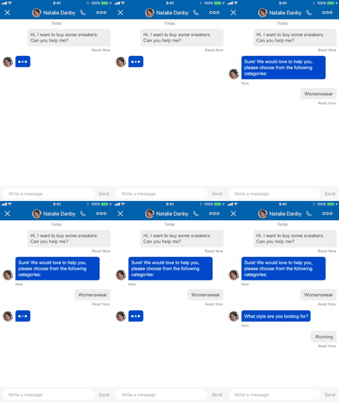
Web Messaging and the Mobile SDK channels now allow for Quick Replies.
Conversational Cloud enables creating and displaying up to 24 Quick Replies per template (that is, a consumer will have up to 24 replies to choose from per template they receive).
Each reply can have:
-
Title: up to 25 characters (above 25, Conversational Cloud's default client like the Mobile App SDK will insert an ellipsis after 22 and obscure the rest of the text. If you're building your own client, you can handle this as you'd like, defining your own character limit)
-
Click operation: with actions and metadata
-
Styling elements: for full branding and styling needs
When a Quick Reply is tapped, the rest of the replies are dismissed. The agent can see the entirety of the Quick Replies group at all times, even if it is no longer visible to the consumer (after they make a selection, for example).

Template Properties
| Property Name | Description | Type | Required | Size Limit |
|---|---|---|---|---|
| type | Must be quickReplies
|
String | Y | |
| itemsPerRow | Number of items per row | Number | Y | 8 items |
| replies | A list of replies | Array | Y | 24 items |
Quick Reply Element
| Property Name | Description | Type | Required | Size Limit |
|---|---|---|---|---|
| type | Type of element. Must be 'button' | Enum | Y | |
| title | Reply title | String | Y | 25 chars |
| click | On-click operation (included metadata and/or actions clauses) | Y | ||
| tooltip | Reply tooltip, used also as aria | String | N | 256 chars |
| style | Styling elements for the reply. | Container | N |
For the 'click' property, you will want to use the publishText action.
For the 'style' property of a reply, please see the Styling section.
Example
{
  "type": "quickReplies",
  "itemsPerRow": 8,
  "replies": [
    {
      "type": "button",
      "tooltip": "yes I do",
      "title": "yes",
      "click": {
        "actions": [
          {
            "type": "publishText",
            "text": "yep"
          }
        ],
        "metadata": [
          {
            "type": "ExternalId",
            "id": "Yes-1234"
          }
        ]
      },
      "style": {
        "color": "###fff",
        "border-color": "###444",
        "background-color": "###333",
        "border-radius": 25,
        "bold": true
      }
    },
    {
      "type": "button",
      "tooltip": "No!",
      "title": "No!",
      "click": {
        "actions": [
          {
            "type": "publishText",
            "text": "No!"
          }
        ],
        "metadata": [
          {
            "type": "ExternalId",
            "id": "No-4321"
          }
        ]
      }
    }
  ]
}
Styling
Each Quick Reply can have its own style elements.
Additional styling configuration is available for Mobile SDK: Android | iOS
Properties
| Property Name | Description | Type |
|---|---|---|
| bold | Whether the text is bold or not | Boolean |
| italic | Whether the text is in italics or not | Boolean |
| color | Defines the element's color | String — hex color |
| border-color | Defines the element's border color | String — hex color |
| border-radius | Defines the element's border-radius | Number |
| background-color | Defines the element's background color | String — hex color |
| size | Defines the element's size | Enum — small/medium/large |
Example
"style": {
	"bold": true,
	"italic": true,
	"color": "###453533",
	"border-color": "###000000",
	"border-radius": 5,
	"background-color": "###3E47A0",
	"size": "small"
}
Best Practices
-
A Quick Reply template does not exist on its own. An agent sends a message to the consumer (a question, a remark or even a Structured Content message) followed by a bundle of Quick Replies. For example, a message such as "In which color would you like this product?" would be followed by a bundle of buttons with "Red", "Black", "Blue" etc. as possible replies. When designing the Quick Reply template, you should also design the coupled message assigned to it.
-
Use Quick Replies to prompt for specific next steps, or use them as answers for surveys or conversational forms.
-
Use short texts in the reply's content — be brief and precise.
-
If you wish the agent to be able to follow the consumer's clicks, we recommend adding a
publishTextclick-event to each reply. The publish-text click-event will add a message to the transcript on behalf of the consumer, which will be available for the agent to follow and record for later use. -
Don't use Quick Replies if you wish to let consumers use them more than once in a conversation (like a menu a consumer can go back to). Quick Replies disappear after being clicked (or consumer made another action in the conversation window). Use Structured Content templates instead as they stay persistent in the conversation.
-
If a consumer decides to type the text of the reply, instead of clicking on it, then no click-operation will be executed (no action or metadata will be sent to the server). If your bot depends on such data, consider "teaching" the bot to accept typed-replies, and not just clicked-replies.
Limitations
- Once
itemsPerRowis set (max 8), the number of rows is calculated automatically (up to 3 rows). If the number of replies exceedsitemsPerRowtimes 3, then extra replies will be added to the last row. - A reply's title is set to have a maximum of 25 characters. If more are set, then the first 22 characters will be used with ellipsis.
