These attributes are relevant for version 4.1 of the SDK and lower. For the list of current attributes, please see this document.
The goal of the following document is to enumerate the different fields controlling design attributes in the SDK. If a clearer view of which attribute corresponds with a design element is needed, please utilize the Attributes Design Sheet.
Agent assignment
retrieveAssignedAgentFromLastClosedConversation
When using getAssignedAgent method, lets you get assigned agents from active conversations only, or from the last closed conversation in case there is no active conversation. If no assigned agent is available, this method returns nil.
- Type: Bool
- Default value: true
Audio support
recordingDurationLimit
Maximum time frame for recording audio message (in seconds).
- Type: TimeInterval (Double)
- Default value: 120
enableAudioSharing
When set to true, the audio sharing features gets enabled.
- Type: Bool
- Default value: false (disabled)
maxNumberOfSavedAudioFilesOnDisk
Number representing how many audio files saved on the disk. Exceeding the max value of files get deleted when the app closes.
- Type: Int
- Default value: 20
Brand
brandName
The brand name will be shown as a title on toolbar when there is no active conversation.
- Type: String
- Default value: "" (Empty String)
conversationBackgroundColor
Color code for the entire view background.
- Type: UIColor
- Default value: UIColor.white
customFontNameConversationFeed
Custom font name for conversation feed, which affects all messages, timestamps and separators. If the fonts are not part of the iOS families, you must define them in App's Info.plist.
- Type: String?
- Default value: nil
customFontNameNonConversationFeed
Custom font name for all non conversation feed controls. Such as: Buttons, Alerts, Banners, Menu and External Windows. If the fonts are not part of the iOS families, you must define them in App's Info.plist.
- Type: String?
- Default value: nil
customRefreshControllerImagesArray
Array of images for creating the custom refresh controller that loops the images from the array. You must have two or more images in the array for it to work properly.
- Type: <ArrayUIImage>?
- Default value: nil
customRefreshControllerAnimationSpeed
Custom refresh controller speed animation define the full images loop time. Smaller values create high speed animation.
-
Type: Float
- Default value: 2
conversationBackgroundPortraitImage
When not nil, use this attribute as the conversation portrait background image. When an image is shown, it is recommended to set dateSeparatorBackgroundColor config to clear.
- Type: UIImage;
- Default value: nil
conversationBackgroundLandscapeImage
When not nil, use this attibute as the conversation landscape background image. When an image is shown, it is recommended to set dateSeparatorBackgroundColor config to clear.
- Type: UIImage;
- Default value: nil
conversationBackgroundImageContentMode
Defines the content mode of the conversation background image.
- Type: UIViewContentMode;
- Default value: scaleToFill
Connection Status Bar
connectionStatusConnectingBackgroundColor
Color code for the background of the connection status bar while connecting.
- Type: UIColor
- Default value: #f5f5f5f2

connectionStatusConnectingTextColor
Color code for the text of the connection status bar while connecting.
- Type: UIColor
- Default value: #46474a
connectionStatusFailedToConnectBackgroundColor
Color code for the background of the connection status bar when connection failed.
- Type: UIColor
- Default value: #000000cc

connectionStatusFailedToConnectTextColor
Color code for the text of the connection status bar when connection failed.
- Type: UIColor
- Default value: UIColor.white
Controller message
controllerBubbleTextColor
Color code for the text of the controller bubble.
- Type: UIColor
- Default value: #5b5c5e

Conversations
maxPreviousConversationToPresent
Number of conversations to show in advance.
- Type: UInt
- Default value: 2
deleteClosedConversationOlderThanMonths
Upon SDK initialization, all closed conversations with an end date older than X months get deleted from the database. Setting 0 deletes all closed conversations.
- Type: UInt
- Default value: 13
sendingMessageTimeoutInMinutes
Maximum number of minutes to send the message.
- Type: UInt
- Default value: 60
conversationSeparatorTextColor
Conversation separator text and line color.
- Type: UIColor
- Default value: UIColor.black
enableConversationSeparatorTextMessage
Toggle conversation separator text message when conversation resolved from agent or consumer.
- Type: Bool
- Default value: true
enableConversationSeparatorLine
Toggle conversation separator line when conversation resolved from agent or consumer.
- Type: Bool
- Default value: true
conversationSeparatorFontSize
Define the conversation closed separator font size.
- Type: UIFontTextStyle
- Default value: UIFontTextStyle.caption1
conversationSeparatorBottomPadding
Define the conversation Closed label to separator line padding.
- Type: Float
- Default value: 7
conversationSeparatorFontName
Custom font name for conversation closed separator. Fonts that are not part of the iOS families, must be defined in App's Info.plist.
- Type: Float
- Default value: 7
conversationSeparatorViewBottomPadding
Define the conversation separator view bottom padding.
- Type: String
- Default value: nil
conversationClosedSeparatorTopPadding
Define the conversation Closed Separator Top padding.
- Type: Float
- Default value: 5
enableVibrationOnMessageFromRemoteUser
Toggle vibration sound when a remote user sends a new message.
- Type: Bool
- Default value: false
announceAgentTyping
If true, show agent is typing indicator in selected position and accessibility will announce when agent is typing a message to the consumer. If false, will not show any indication, and will not announce when agent is typing a message.
- Type: Bool
- Default value: true
showAgentTypingInMessageBubble
If true, shows agent is typing indicator in a message bubble. If false, show indicator under Agent label in navigator bar. if announceAgentTyping is false, will not show any "is typing" indicator regardless of current value.
- Type: Bool
- Default value: true
Data masking
enableClientOnlyMasking
When set to true, you can control which part of the text to mask. All masked data appear as asterisks and gets saved to the local DB masked and sent to the server unmasked.
- Type: Bool
- Default value: false
enableRealTimeMasking
When set to true, you can control which part of the text to mask. All masked data appear as asterisks and gets saved to the local DB masked and sent to the server unmasked.
- Type: Bool
- Default value: false
clientOnlyMaskingRegex
A regular expression string that lets you can control which part of the text to mask. All masked data appear as asterisks and gets saved to the local DB masked and sent to the server unmasked.
The regular expression patterns and behavior are based on Perl's regular expressions. See Apple Reference.
- Type: String
- Default value: "" (Empty String) — no regex
realTimeMaskingRegex
A regular expression string that lets you can control which part of the text to mask. All masked data appear as asterisks and gets saved to the local DB masked and sent to the server unmasked.
The regular expression patterns and behavior are based on Perl's regular expressions. See Apple Reference.
- Type: String
- Default value: "" (Empty String) — no regex
Date and time
lpDateFormat
Custom formatting for date string (day, year, …), for example, "d MMM". If not defined, one of the default styles will be used (see timestamps formatting).
- Type: String?
- Default value: nil
lpTimeFormat
Custom formatting for time string (hours, lpDateTimeFormat minutes..), for example, "hh:mm a". If not defined, one of the default styles will be used (see timestamps formatting).
- Type: String?
- Default value: nil
lpDateTimeFormat
Custom formatting for date and time string, for example, "EEEE MM/dd/YY hh:mm a". If not defined, one of the default styles will be used (see timestamps formatting).
- Type: String?
- Default value: nil
Date separator
dateSeparatorTitleBackgroundColor
Color code for date separator title background color.
- Type: UIColor
- Default value: UIColor.white

dateSeparatorTextColor
Color code for date separator text color.
- Type: UIColor
- Default value: #46474A

dateSeparatorLineBackgroundColor
Color code for date separator line background color.
- Type: UIColor
- Default value: UIColor.clear

dateSeparatorBackgroundColor
Color code for date separator background color.
- Type: UIColor
- Default value: #FFFFFF

dateSeparatorFontSize
Define the Date Separator font text style.
- Type: UIFontTextStyle
- Default value: UIFontTextStyle.footnote
customFontNameDateSeparator
Custom font name for Timestamp. Fonts that are not part of the iOS families, must be defined in App's Info.plist.
- Type: String
- Default value: nil

dateSeparatorTopPadding
Define the Date Separator top padding.
- Type: Float
- Default value: 0

dateSeparatorBottomPadding
Define the Date Separator bottom padding.
- Type: Float
- Default value: 0

Delivery Notifications
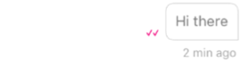
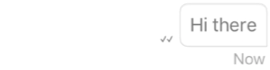
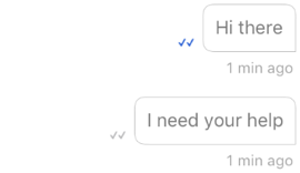
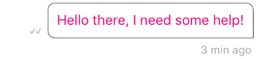
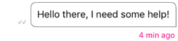
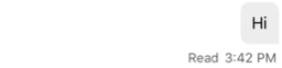
checkmarkVisibility
Checkmark visibility of the following options (type CheckmarksState): SentOnly — Show checkmarks for only Sent messages. SentAndAccepted — Show checkmarks for only Sent and Accepted messages. All — Show checkmarks for Sent, Accepted and Read messages.
- Type: CheckmarksState(Integer Enum)
- Default value: CheckmarksState.All
checkmarkReadColor
Color of checkmark indication signs of Read messages.
- Type: UIColor
- Default value: #004DC9
checkmarkDistributedColor
Color of checkmark indication signs of Distributed messages.
- Type: UIColor
- Default value: #5B5C5E
checkmarkSentColor
Color of checkmark indication signs of Sent messages.
- Type: UIColor
- Default value: #5B5C5E

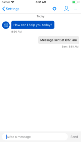
isReadReceiptTextMode
Two options for read indication: Read Receipt with Text Mode Read. Receipt with Icon Mode. If the parameter set as true the mode will be Text. If the parameter set as false the mode will be Icon.
- Type: Bool
- Default value: true
messageStatusNumericTimestampOnly
When false (default), timestamps display information relative to when sent/distributed/read, for example, "sent 5 minutes ago". When true, shows as numeric only, for example, "11:32".
- Type: Bool
- Default value: false
Duration of local notifications
notificationShowDurationInSeconds
Display duration of the local notification in seconds. When in VoiceOver mode it gets extended to 60 sec.
Examples: TimeToRespond notification, local notification, etc.
- Type: Double
- Default value: 3 (60 when in VoiceOver mode)
Link preview
enableLinkPreview
Enable or disable link preview feature. If disabled, user will not see site's link preview or link preview.
- Type: Bool
- Default value: true
linkPreviewBackgroundColor
Color code for the background of the link preview area inside cell.
- Type: UIColor
- Default value: UIColor.white
linkPreviewTitleTextColor
Color code for the title text inside link preview area inside cell.
- Type: UIColor
- Default value: UIColor.black
linkPreviewDescriptionTextColor
Color code for the description text inside link preview area inside cell.
- Type: UIColor
- Default value: #5B5C5E
linkPreviewSiteNameTextColor
Color code for the description site name link preview area inside cell.
- Type: UIColor
- Default value: #E2E3E3
linkPreviewBorderWidth
Double number for the outline width of link preview area inside cell.
- Type: Double
- Default value: 1.0
linkPreviewStyle
Refers to the style in which the link preview cell will be displayed.
- Type: LPUrlPreviewStyle
- Default value: LPUrlPreviewStyle.slim


urlRealTimePreviewBackgroundColor
The background color of the url real time preview.
- Type: UIColor
- Default value: UIColor.white

urlRealTimePreviewBorderColor
The border color of the url real time preview.
- Type: UIColor
- Default value:
urlRealTimePreviewBorderWidth
The border width of the url real time preview.
- Type: Float
- Default value: 1.0
urlRealTimePreviewTitleTextColor
The title text color of the url real time preview.
- Type: UIColor
- Default value: UIColor.Black
urlRealTimePreviewDescriptionTextColor
The description text color of the url real time preview.
- Type: UIColor
- Default value: #5b5c5e

useNonOGTagsForLinkPreview
The urlPreview attribute also uses non-OG tags to parse urls instead of using only OG tags if useNonOGTagsForLinkPreview is true.
- Type: Bool
- Default value: true
Localization
country
Country code: When it is not nil, it will be combined with "language" ("language_country", for example: en_US) and used instead of device default locale when formatting date and time. If no value is provided, the SDK will use the country according to the device's locale.
- Type: String?
- Default value: nil
language
Language used instead of default device language.
The LPLanguage enum contains all languages supported by the MessagingSDK, and affects the following areas:
-
Used when getting localized strings.
-
Combined with "country" ("language_country", for example: en_US) and used instead of default device locale when formatting time and date. If no value is provided, the SDK uses the device's language as default.
- Type: LPLanguage
- Default value: DeviceLanguage
Navigation
conversationNavigationBackgroundColor
Background color of navigation bar in conversation screen.
- Type: UIColor
- Default value: #0362AC
conversationNavigationTitleColor
Navigation title color in conversation screen.
- Type: UIColor
- Default value: #FFFFFF
conversationStatusBarStyle
Status bar style in conversation screen.
- Type: UIStatusBarStyle
- Default value: .LightContent
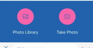
Photo and file sharing
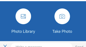
enablePhotoSharing
True — Enables Photo Sharing feature, False — Disables Photo Sharing.
- Type: Bool
- Default value: false
maxNumberOfSavedFilesOnDisk
This number represents how many files will be saved on the disk. Exceeding files are deleted when the app closes.
- Type: Int
- Default value: 20
photosharingMenuBackgroundColor
Photo Sharing menu background color.
- Type: UIColor
- Default value: #0362AC
photosharingMenuButtonsBackgroundColor
Photo Sharing menu buttons background color.
- Type: UIColor
- Default value: UIColor.white
photosharingMenuButtonsTintColor
Photo Sharing menu buttons tint color.
- Type: UIColor
- Default value: #0362AC
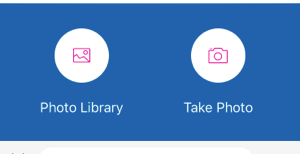
photosharingMenuButtonsTextColor
Photo Sharing menu buttons text color.
- Type: UIColor
- Default value: UIColor.white

cameraButtonEnabledColor
Photo Sharing Camera button color in enabled mode in the conversation screen. Will be presented only if photo sharing feature is enabled.
- Type: UIColor
- Default value: #0362AC

cameraButtonDisabledColor
Photo Sharing Camera button color in disabled mode in the conversation screen. Will be presented only if photo sharing feature is enabled.
- Type: UIColor
- Default value: #8B8A8F
fileCellLoaderFillColor
Radial loader fill color.
- Type: UIColor
- Default value: UIColor(white: 0.0, alpha: 0.5)

fileCellLoaderRingProgressColor
Radial loader progress color.
- Type: UIColor
- Default value: UIColor.white

fileCellLoaderRingBackgroundColor
Radial loader progress background color.
- Type: UIColor
- Default value: UIColor.lightGray

The disabled/enabled color of the Camera button, which is in the input text view, changes according to the sendButtonDisabledTextColor and sendButtonEnabledTextColor parameters.
photoSharingOpenMenuImageButton
Photo sharing open menu custom button.
- Type: UIImage
- Default value:

photoSharingCloseMenuImageButton
Photo sharing close menu custom button.
- Type: UIImage
- Default value:

photoSharingMenuCameraImage
Custom camera image in the photo sharing menu.
- Type: UIImage
- Default value:

photoSharingMenuLibraryImage
Custom Library image in the photo sharing menu.
- Type: UIImage
- Default value:

fileSharingMenuFileImage
Custom file image in the file Sharing Menu.
- Type: UIImage
- Default value:

fileSharingUniversalFileThumbnailimage
Image for custom the thumbnail of unsupported files in file sharing.
- Type: UIImage
- Default value:

fileSharingPDFFileThumbnailimage
Image for custom the thumbnail of PDF files in file sharing.
- Type: UIImage
- Default value:

fileSharingPPTXFileThumbnailimage
Image for custom the thumbnail of PPTX files in file sharing
- Type: UIImage
- Default value:

fileSharingDOCXFileThumbnailimage
Image for custom the thumbnail of DOCX files in file sharing
- Type: UIImage
- Default value:

fileSharingXLSXFileThumbnailimage
Image for custom the thumbnail of XLSX files in file sharing
- Type: UIImage
- Default value:

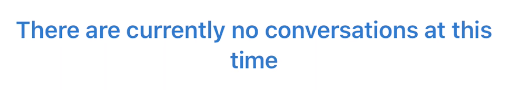
conversationEmptyStateTextColor
Color code for the empty state label.
- Type: UIColor()
- Default value: black
Quick reply
quickReplyButtonVerticalPadding
Distance between the bottom and top edges of the button to the bottom and top edges of the text.
- Type: CGFloat
- Default value: 10.0
quickReplyButtonHorizontalPadding
Distance between the right and left edges of the button to the right and left edges of the text.
- Type: CGFloat
- Default value: 15.0
quickReplyVerticalPadding
Vertical padding between quick reply buttons.
- Type: CGFloat
- Default value: 10.0
quickReplyHorizontalPadding
Horizontal padding between quick reply buttons.
- Type: CGFloat
- Default value: 10.0
quickReplyButtonBorderWidth
Border size of Quick Reply buttons.
- Type: CGFloat
- Default value: 1.0
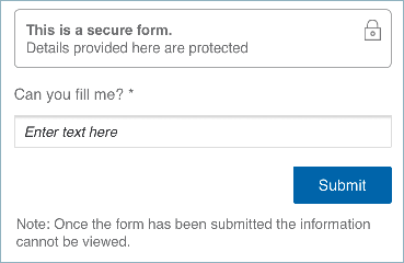
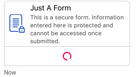
Secure form
secureFormBackButtonColor
Back button color in secure form screen.
- Type: UIColor
- Default value: UIColor.black
secureFormUIStatusBarStyleLightContent
Should display status bar of the secure form screen in Light Content Mode (UIStatusBarStyle).
- Type: Bool
- Default value: true
secureFormNavigationBackgroundColor
Background color of navigation bar in secure form screen.
- Type: UIColor
- Default value: #229A49
secureFormNavigationTitleColor
Navigation title color in secure form screen.
- Type: UIColor
- Default value: UIColor.white
secureFormBubbleBackgroundColor
Secure form bubble background color.
- Type: UIColor
- Default value: UIColor.white
secureFormBubbleBorderColor
Secure form bubble border color.
- Type: UIColor
- Default value: #d4d4d5
secureFormBubbleBorderWidth
Secure form bubble border width in pixels.
- Type: Double
- Default value: 2.0
secureFormBubbleTitleColor
Secure form bubble form title color.
- Type: UIColor
- Default value: UIColor.black
secureFormBubbleDescriptionColor
Secure form bubble fill form text button color.
- Type: UIColor
- Default value: #5b5c5e
secureFormBubbleFillFormButtonTextColor
Secure form bubble fill form text button color.
- Type: UIColor
- Default value: #004dc9
secureFormBubbleFillFormButtonBackgroundColor
Secure form bubble fill form button background color.
- Type: UIColor
- Default value: UIColor.clear
secureFormBubbleFormImageTintColor
Secure form bubble form image tint color.
- Type: UIColor
- Default value: #004dc9
secureFormCustomFontName
Secure form custom font name to be used while user is filling the secure form. If not set, the default font will be Helvetica.
- Type: String
- Default value: Helvetica
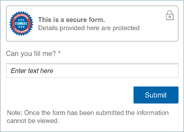
secureFormHideLogo
Secure form flag for hiding the secure form logo in the top of the form.
- Type: Bool
- Default value: false
secureFormBubbleLoadingIndicatorColor
Secure form loading indicator color while loading form before opening.
- Type: UIColor
- Default value: #46474a
Send button
sendButtonDisabledColor
Color code for Send and Camera (of Photo Sharing) buttons in disabled mode.
- Type: UIColor
- Default value: #AAAAAA
sendButtonEnabledColor
Color code for Send and Camera (of Photo Sharing) buttons in disabled mode.
- Type: UIColor
- Default value: #0362AC
sendButtonImage
Send button Image in the conversation screen. The custom image changes only if isSendMessageButtonInTextMode = false.
- Type: UIImage
- Default value: SDK bundle sendMessageIcon Icon
isSendMessageButtonInTextMode
You have two options for the send message button mode: text mode (taken from localized resources) and icon mode.
- Type: Bool
- Default value: text mode
Structured content
enableStrucutredContent
Enable or Disable toggle for Structured Content feature in conversations.
- Type: Bool
- Default value: false
structuredContentBubbleBorderWidth
Structured Content bubble border width in pixels.
- Type: Double
- Default value: 1.0
structuredContentBubbleBorderColor
Structured Content bubble border color.
- Type: UIColor
- Default value: #004DC9
structuredContentBubbleTopLeftCornerRadius
Structured Content bubble top left corner radius in pixels.
- Type: Float
- Default value: 8.0
structuredContentBubbleTopRightCornerRadius
Structured Content bubble top right corner radius in pixels.
- Type: Float
- Default value: 8.0
structuredContentBubbleBottomLeftCornerRadius
Structured Content bubble bottom left corner radius in pixels.
- Type: Float
- Default value: 8.0
structuredContentBubbleBottomRightCornerRadius
Structured Content bubble bottom right corner radius in pixels.
- Type: Float
- Default value: 8.0
structuredContentMapLatitudeDeltaDeltaSpan
Structured Content Latitude Delta Span. Used to determine which area of the map to focus on. If you set this attribute, you must also set structuredContentMapLongitudeDeltaSpan. This parameter is used to create an MKCoordinateSpan.
- Type: Double
- Default value: 0.01
structuredContentMapLongitudeDeltaSpan
Structured Content Longitude Delta Span. Used to determine which area of the map to focus on. If you set this attribute, you must also set structuredContentMapLatitudeDeltaDeltaSpan. This parameter is used to create an MKCoordinateSpan.
- Type: Double
- Default value: 0.01
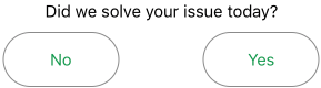
Survey buttons (CSAT and FCR)
csatSubmitButtonCornerRadius
Corner radius of the Submit button.
- Type: Double
- Default value: 30

csatYesNoButtonsCornerRadius
Corner radius of the resolution Yes/No buttons.
- Type: Double
- Default value: 25
csatSubmitButtonBackgroundColor
Background color code of the Submit button.
- Type: UIColor
- Default value: #229A49

csatSubmitButtonTextColor
Text color code of the Submit button.
- Type: UIColor
- Default value: UIColor.white

csatRatingButtonSelectedColor
Background Color code of the rating buttons.
- Type: UIColor
- Default value: #229A49

csatResolutionButtonSelectedColor
Color code for the FCR survey buttons (YES/NO) when selected.
- Type: UIColor
- Default value: #229A49

csatAllTitlesTextColor
Title text color for all labels.
- Type: UIColor
- Default value: UIColor.black
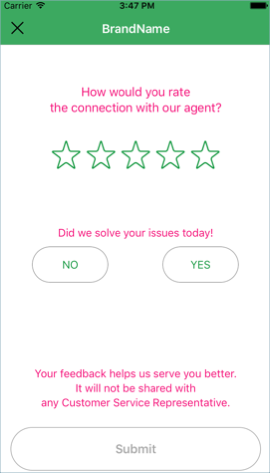
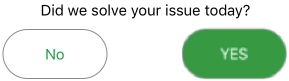
csatResolutionHidden
Hides the FCR survey (YES/NO) question.
- Type: Bool
- Default value: false
csatAgentViewHidden
Hides the view of agent avatar and name.
- Type: Bool
- Default value: true

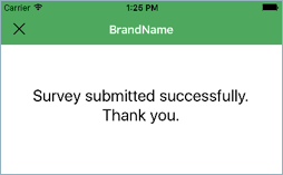
csatThankYouScreenHidden
Hides the Thank You screen after tapping Submit button.
- Type: Bool
- Default value: false
csatNavigationBackgroundColor
Background color of the navigation of the survey.
- Type: UIColor
- Default value: #229A49
csatNavigationTitleColor
Text color of the title in the survey navigation.
- Type: UIColor
- Default value: UIColor.white
csatSkipButtonColor
Skip survey button color.
- Type: UIColor
- Default value: UIColor.black
csatUIStatusBarStyleLightContent
Allow the UI status bar to take the color of the survey navigation bar color.
- Type: Bool
- Default value: true
csatShowSurveyView
Hides the whole survey view and disables it.
- Type: Bool
- Default value: true
csatSurveyExpirationInMinutes
Expiration of CSAT in minutes from the moment the conversation was ended. If Survey exceeded the expiration, it does not get presented to the user.
- Type: UInt
- Default value: 1440
System messages
systemBubbleTextColor
Color code for the text of the system messages.
- Type: UIColor
- Default value: UIColor.black
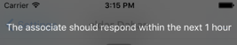
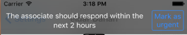
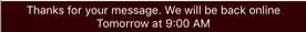
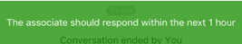
Time to response and off hours
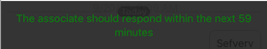
ttrShouldShow
When set to true, the TTR notifications show with off hours. When the auto messages feature is enabled, TTR notifications do not display when the auto messages feature is enabled, regardless of the value set for this attribute.
- Type: Bool
- Default value: true
ttrShowShiftBanner
Enable or disable shift toaster ('An agent will respond…’).
- Type: Bool
- Default value: true
ttrFirstTimeDelay
Number of seconds before the first Time to Respond (TTR) notification appears.
- Type: Double
- Default value: 10
ttrShouldShowTimestamp
When set to true, the timestamp of the TTR notification displays. Otherwise, the "An agent will respond shortly" message displays.
- Type: Bool
- Default value: false
ttrShowFrequencyInSeconds
Controls the TTR frequency, for example, don’t show the TTR more than once in 8 seconds.
- Type: UInt
- Default value: 8
showUrgentButtonInTTRNotification
When set to true, the Urgent button shows in the TTR notification.
- Type: Bool
- Default value: false
showOffHoursBanner
Enable or disable the off-hours toaster.
- Type: Bool
- Default value: true
ttrBannerBackgroundColor
Background color for banner.
- Type: UIColor
- Default value: #52A742
ttrBannerTextColor
Text color of the banner.
- Type: UIColor
- Default value: #52A742
ttrBannerOpacityAlpha
Opacity level of the banner background (values: 0.0 – 1.0).
- Type: Double
- Default value: 0.8

offHoursTimeZoneName
Off Hours time zone name string based on [NSTimeZone knownTimeZoneNames]. If sending empty string, the local timezone will be used (Server sends UTC time).
- Type: String
- Default value: "" (Empty String)
Unread messages
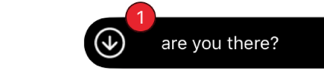
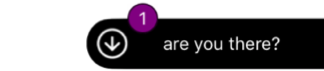
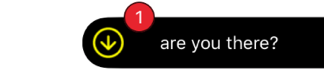
scrollToBottomButtonBackgroundColor
Scroll to bottom button background color of the whole button.
- Type: UIColor
- Default value: UIColor.black
scrollToBottomButtonMessagePreviewTextColor
Scroll to bottom button text color of the last unread message preview.
- Type: UIColor
- Default value: UIColor.white
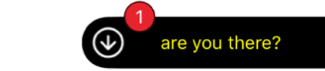
scrollToBottomButtonBadgeBackgroundColor
Scroll to bottom button unread message badge background color.
- Type: UIColor
- Default value: #E7242D
scrollToBottomButtonBadgeTextColor
Scroll to bottom button unread message badge text color.
- Type: UIColor
- Default value: UIColor.white
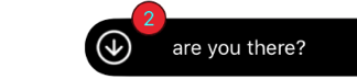
scrollToBottomButtonArrowColor
Scroll to bottom button arrow tint color.
- Type: UIColor
- Default value: UIColor.white
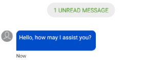
unreadMessagesDividerBackgroundColor
Unread Messages divider background color.
- Type: UIColor
- Default value: #F5F5F5
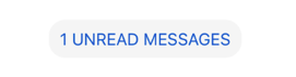
unreadMessagesDividerTextColor
Unread Messages divider text color.
- Type: UIColor
- Default value: #004DC9

scrollToBottomButtonEnabled
Toggle the mode of the Scroll to bottom button.
- Type: Bool
- Default value: true
scrollToBottomButtonMessagePreviewEnabled
Toggle the mode of the Scroll to bottom unread message text preview.
- Type: Bool
- Default value: true
unreadMessagesDividerEnabled
Toggle the mode of the Unread Messages divider. If unreadMessagesDividerEnabled is disabled, the "scroll to bottom" button will scroll to bottom of the conversation but the count indicator and message preview will not be displayed".
Regardless of unreadMessagesDividerEnabled value, the conversation screen will always scrolls to the last position where the user left off.
- Type: Bool
- Default value: true
unreadMessagesCornersRadius
Define the corners radius of the unread messages bubble.
- Type: Float
- Default value: 8 for all the corners
scrollToBottomButtonCornerRadius
Define the corner radius for the left top and left bottom of the scroll down indicator.
- Type: Float
- Default value: 20 for left top and the left bottom corners
scrollToBottomButtonBadgeCornerRadius
Define the corners radius of the unread messages counter inside the scroll down indicator.
- Type: Float
- Default value: 12 for all the corners
User avatar
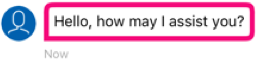
remoteUserAvatarBackgroundColor
Background color of the remote user’s avatar.
- Type: UIColor
- Default value: #004DC9
remoteUserAvatarLeading
Define the remote avatar Leading padding (left edge to avatar).
- Type: Float
- Default value: 8
remoteUserAvatarTrailingPadding
Define the remote avatar Trailing padding (Avatar to bubble).
- Type: Float
- Default value: 8
remoteUserAvatarIconColor
Icon color of default remoteUser avatar.
- Type: UIColor
- Default value: #FFFFFF
remoteUserDefaultAvatarImage
Default Avatar image of the remote user. When assigned, image disables the remoteUserAvatarBackgroundColor and remoteUserAvatarIconColor configurations. If remote user has an avatar image in his profile, this attribute gets ignored.
- Type: UIImage?
- Default value: nil
brandAvatarImage
Set avatar image for the brand, and is an optional UIImage that if set to nil a default avatar displays. Image ratio must be 1:1 (square) and at least 50x50 pixels.
- Type: UIImage?
- Default value: nil
csatAgentAvatarBackgroundColor
Background color of agent's default avatar in CSAT.
- Type: UIColor
- Default value: #004DC9
csatAgentAvatarIconColor
Icon color of agent's default avatar in CSAT.
- Type: UIColor
- Default value: #FFFFFF
User input view
inputTextViewContainerBackgroundColor
User Input TextView container background color.
- Type: UIColor
- Default value: #F5F5F5

inputTextViewCornerRadius
User Input TextView corner radius.
- Type: Double
- Default value: 20.0
User's bubble
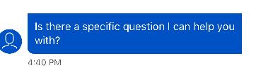
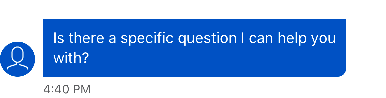
remoteUserBubbleBackgroundColor
Color code for the background of the remote user's bubble.
- Type: UIColor
- Default value: #004DC9
remoteUserBubbleBorderColor
Color code for the outline color.
- Type: UIColor
- Default value: #004DC9
remoteUserBubbleLinkColor
Color code for links in the text of the remote user's bubble.
- Type: UIColor
- Default value: UIColor.white

remoteUserBubbleTextColor
Color code for the text of the remote user's bubble.
- Type: UIColor
- Default value: UIColor.white
remoteUserBubbleBorderWidth
Double number for the outline width.
- Type: Double
- Default value: 2
remoteUserBubbleTimestampColor
Color code for the timestamp of the remote user's bubble.
- Type: UIColor
- Default value: #5B5C5E
remoteUserTypingTintColor
Color of the remote user typing bubbles animation.
- Type: UIColor
- Default value: UIColor.white

remoteUserBubbleLongPressOverlayColor
Color of the remote user's bubble overlay when user uses a long press gesture on the bubble. Overlay will appear as long as the menu controller appears on the bubble. When the menu dismissed, overlay will disappear too. In order to show overlay, enableBubblesOverlayOnLongPress should be true.
- Type: UIColor
- Default value: UIColor.black
remoteUserBubbleLongPressOverlayAlpha
Alpha of the remote user's bubble overlay when user uses a long press gesture on the bubble. Value can be 0.0 – 1.0. Overlay will appear as long as the menu controller appears on the bubble. When the menu is dismissed, overlay will disappear too. In order to show overlay, enableBubblesOverlayOnLongPress should be true.
- Type: Float
- Default value: 0.3
remoteUserBubbleTopLeftCornerRadius
Top left Radius corner on the Remote bubble. Setting the radius to a value greater than 0.0 causes the bubble's layer to begin drawing rounded corners on its background. This attribute affects the bubble's masking and it's recommended to use a corner radius which is at max equals to half of the bubble's height. Setting a corner radius larger than half of the bubble's height will cause text to cut visually.
- Type: Float
- Default value: 8
remoteUserBubbleTopRightCornerRadius
Top right Radius corner on the Remote bubble. Setting the radius to a value greater than 0.0 causes the bubble's layer to begin drawing rounded corners on its background. This attribute affects the bubble's masking and it's recommended to use a corner radius which is at max equals to half of the bubble's height. Setting a corner radius larger than half of the bubble's height will cause text to cut visually.
- Type: Float
- Default value: 8
remoteUserBubbleBottomLeftCornerRadius
Bottom left Radius corner on the Remote bubble. Setting the radius to a value greater than 0.0 causes the bubble's layer to begin drawing rounded corners on its background. This attribute affects the bubble's masking and it's recommended to use a corner radius which is at max equals to half of the bubble's height. Setting a corner radius larger than half of the bubble's height will cause text to cut visually.
- Type: Float
- Default value: 0
remoteUserBubbleBottomRightCornerRadius
Bottom right Radius corner on the Remote bubble. Setting the radius to a value greater than 0.0 causes the bubble's layer to begin drawing rounded corners on its background. This attribute affects the bubble's masking and it's recommended to use a corner radius which is at max equals to half of the bubble's height. Setting a corner radius larger than half of the bubble's height will cause text to cut visually.
- Type: Float
- Default value: 8
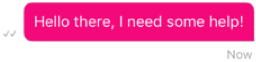
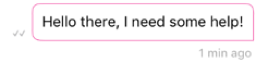
userBubbleBackgroundColor
Color code for the background of the visitor bubble.
- Type: UIColor
- Default value: #EDEDED
userBubbleBorderColor
Color code for the outline color.
- Type: UIColor
- Default value: #EDEDED
userBubbleLinkColor
Color code for links in the text of the visitor bubble.
- Type: UIColor
- Default value: #0000ee

userBubbleTextColor
Color code for the text of the visitor bubble.
- Type: UIColor
- Default value: UIColor.black
userBubbleBorderWidth
Double number for the outline width.
- Type: Double
- Default value: 1
userBubbleTimestampColor
Color code for the timestamp of the visitor bubble.
- Type: UIColor
- Default value: #5B5C5E
userBubbleSendStatusTextColor
Color code for the send status text of the visitor bubble.
- Type: UIColor
- Default value: #5B5C5E
userBubbleErrorTextColor
Color code for the error view text of the visitor bubble.
- Type: UIColor
- Default value: #DE0A23

userBubbleErrorBorderColor
Color code for the error view border of the visitor bubble.
- Type: UIColor
- Default value: #DE0A23
userBubbleLongPressOverlayColor
Color of the user's bubble overlay when user uses a long press gesture on the bubble. Overlay will appear as long as the menu controller appears on the bubble. When the menu is dismissed, overlay will disappear too. In order to show overlay, enableBubblesOverlayOnLongPress should be true.
- Type: UIColor
- Default value: UIColor.black

userBubbleLongPressOverlayAlpha
Alpha of the user's bubble overlay when user use long press gesture on the bubble. Value can be 0.0 – 1.0. Overlay will appear as long as the menu controller appears on the bubble, when the menu dismissed, overlay will disappear too. In order to show overlay enableBubblesOverlayOnLongPress should be true.
- Type: Float
- Default value: 0.3
userBubbleTopLeftCornerRadius
Top left Radius corner on the user's bubble. Setting the radius to a value greater than 0.0 causes the bubble's layer to begin drawing rounded corners on its background. This attribute affects the bubble's masking and it's recommended to use a corner radius which is at max equals to half of the bubble's height. Setting a corner radius larger than half of the bubble's height will cause text to cut visually.
- Type: Float
- Default value: 8
userBubbleTopRightCornerRadius
Top right Radius corner on the user's bubble. Setting the radius to a value greater than 0.0 causes the bubble's layer to begin drawing rounded corners on its background. This attribute affects the bubble's masking and it's recommended to use a corner radius which is at max equals to half of the bubble's height. Setting a corner radius larger than half of the bubble's height will cause text to cut visually.
- Type: Float
- Default value: 8
userBubbleBottomLeftCornerRadius
Bottom left Radius corner on the user's bubble. Setting the radius to a value greater than 0.0 causes the bubble's layer to begin drawing rounded corners on its background. This attribute affects the bubble's masking and it's recommended to use a corner radius which is at max equals to half of the bubble's height. Setting a corner radius larger than half of the bubble's height will cause text to cut visually.
- Type: Float
- Default value: 8
userBubbleBottomRightCornerRadius
Bottom right Radius corner on the user's bubble. Setting the radius to a value greater than 0.0 causes the bubble's layer to begin drawing rounded corners on its background. This attribute affects the bubble's masking and it's recommended to use a corner radius which is at max equals to half of the bubble's height. Setting a corner radius larger than half of the bubble's height will cause text to cut visually.
- Type: Float
- Default value: 0
bubbleEmailLinksRegex
Regular expression for email hyperlinks in users messages (consumer and agent). This attribute is optional. If not assigned, the default link detection will be enabled.
- Type: String?
- Default value: nil
bubbleUrlLinksRegex
Regular expression for url hyperlinks in users messages (consumer and agent). This attribute is optional. If not assigned, the default link detection will be enabled.
- Type: String?
- Default value: nil
bubblePhoneLinksRegex
Regular expression for phone hyperlinks in users messages (consumer and agent). This attribute is optional. If not assigned, the default link detection will be enabled.
- Type: String?
- Default value: nil
bubbleTopPadding
Define the bubble Top Padding.
- Type: Float
- Default value: 10
bubbleBottomPadding
Define the bubble bottom Padding.
- Type: Float
- Default value: 10
bubbleLeadingPadding
Define the bubble Leading Padding.
- Type: Float
- Default value: 10
bubbleTrailingPadding
Define the bubble Trailing Padding.
- Type: Float
- Default value: 10
bubbleTimestampBottomPadding
Define the bubble Trailing Padding.
- Type: Float
- Default value: 5
bubbleTimestampTopPadding
Define the bubble Timestamp Top Padding.
- Type: Float
- Default value: 5
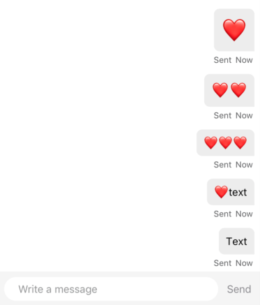
enableEnlargeEmojis
When true, user and remote user messages containing one or two emojis will be enlarged in chat. Messages with one emoji will be the largest, two emojis will be large, and 3 or more will be displayed as normal text.
- Type: Bool
- Default value: false
Window mode
customButtonImage
(Window mode only) Custom button icon image that displays on the navigation bar. When pressed, the LPMessagingSDKCustomButtonTapped callback gets invoked.
- Type: UIImage
- Default value: nil